Thursday 30th June 2011 09:59
Some six years ago, one of the owners of the company where I freelance bought a particular domain name, in the hope that one day, it could be utilised to sell t-shirts with mac and design orientated humour on them. The picture is obviously a whole lot larger than that and we've already started discussing the various categories that could be used, such as military-based designs right through to gardening humour. We're fully aware that this sort of thing has been done before, usually on incomprehensible scales, nevertheless, we're absolutely certain that there will be room in the market for us… given time and a lot of forward planning.

After spending a good hour or more, trying to make the logo work, we finally both agreed that this was exactly the message we wanted to put across and was well worth a lawsuit… more about the whole design and website in the not-too-distant future...
Wednesday 29th June 2011 15:22
As usual, I talk about Wimbledon at some point during the fortnight it takes place from the last week of June and the first week of July. Surprisingly, only the first week was slightly hampered with rain, and it's usually the first week that I miss the most of; not because it doesn't interest me, it's just you have put a substantial amount of time aside to watch a match, particularly the men's singles, which I have the predominant interest in. After all, it's a much faster game and you don't have to put up with the incessant yelping that most of the women feel it necessary to make whilst playing every shot. Sorry, it just completely fucks me off, despite the fact that most of them are proper eye candy.
Anyway, enough of my Wimbledon rants, for I want to talk about an incredible match I watched this afternoon between Jo-Wilfried Tsonga (12) and Roger Federer (3). Tsonga had gone two sets down, losing the first 3-6 and the second actually went to a tie-break, Federer coming out on top once more, (3-7 in the tie-break), leaving Tsonga with a ridiculously large mountain to climb.
Despite Tsonga only managing 70% of his first serves, as opposed to Federer's 75% and the fact that he made four double faults, three more than his Swiss rival and actually doubled his tally of unforced errors, compared with that of Federer, 22 against 11 respectively, he managed to defeat Federer, taking the last three sets 6-4, 6-4, 6-4. I'd love to go into just how incredible this match was, but if you didn't see it, you'll just have to believe me.
For more information about Wimbledon, please click on the graphic I created above.
Tuesday 28th June 2011 09:00
Last year, I may have mentioned that we had a work shadowing day where I freelance. The day comprises of two school pupils who attend a work place and 'shadow' what that particular employee does, often assisting them in the process. Since having some knowledge of what was expected, I didn't feel half as anxious and had already decided to set the same task as the previous year; design a logo that combined their two names, whether that be their first or last names, a graphic that covered an interest they had and some reference to it being a work shadowing day.
Now then, I could spend the rest of this blog talking about what work they did, however I cannot dismiss the two 13-year old girls' links to people in the public eye. The school they attend is well-known for the rich and famous, one of Jude Law's children attends, as does one of Noel Gallagher's, the same applies for one of Laura Ashley's… so you kind of get the picture.

Harriet, one of the girls, told me her Dad was best friends with a photographer who was kidnapped in Afghanistan last year (he's since been released). Whilst working on an assignment for CBS in Basra, he was abducted from a hotel on February 10th 2008. He was held in captivity for two months and was eventually freed after an intense armed battle before one of his kidnappers was arrested, whilst the other three fled.
His photography is incredibly poignant, please click on the logo above to view his gallery.
As if that wasn't enough, the other girl's father was none other than Kenny Jones. The name may not mean a thing to some, whilst he was an incredibly famous drummer of his time. He drummed on such hits as, 'All Or Nothing', 'Lazy Sunday Afternoon' and 'Itchycoo Park'… yes, he was the drummer in the Small Faces. To say I was awestruck is a total and utter understatement. He was also obviously linked with the Faces, The Law and The Jones Gang and, equally as impressive, he did actually drum with The Who, replacing Keith Moon, who died at the age of 32. Jones was The Who's drummer between 1979-1982 but apparently, he was frequently at odds with Roger Daltrey who felt that his drumming style was not right for the band.
Anyway, since The Who had such an iconic band logo and the Small Faces website is still under construction, I thought I'd provide a link to The Who website, so please click on the logo above to access it.
Monday 27th June 2011 20:37
I'm sure we've all, at some point, struggled to write that perfect piece for either a publication, curriculum vitae and such like. I know I'm certainly finding it difficult to create the right copy for my design website… want to capture the essence of everything, yet I may be trying too hard. Well fear not, I have a solution.

The website I'm about to provide a link to today asks the question, "Do you hate having to write your artist statement?" Well, I guess if the answer is yes, you can proceed to read on. You can generate your very own with the 'Arty Bollocks Generator', designed and developed by Joke de Winter, words by David James Ross.
Click on the logo above to access the site and 'Generate some bollocks'.
Sunday 26th June 2011 16:28
We already knew that today was going to be a day of doing bugger all, especially as there might have been hangovers involved… surprisingly though, other than some fuzziness when I first got up, I felt absolutely fine.
I was happy to be staying in actually, it meant I could spend the day catching up with my blog (how many times have you heard that recently? - Ed) and it also meant we could catch up with certain acts that had performed at Glastonbury, most importantly, Elbow.
Guy Garvey and crew really do know how to put on a performance, and they're incredibly humble with it too, the elation on Garvey's face saying it all, especially as this was the largest crowd they'd ever performed to. It seemed so apt to, especially as they were celebrating their 20th anniversary as a band. Performing many tracks off 'Seldom Seen Kid' and 'Build A Rocket Boys!', they had the crowd eating out of their hands. An absolutely sterling performance. Fuck knows what bastard Beyoncé was doing at the festival... a headliner too? Come on!
To find out more about the BBC's coverage of Glastonbury, please click on the logo above.
Saturday 25th June 2011 10:35
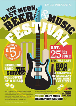
Not letting the side down, we'd arranged to go to another beer festival, this one being located at the Cricket Club in East Meon. Despite the fact that Tanya has lived relatively locally, she'd never been to the picturesque village, located due west of Petersfield in Hampshire.
To find out more about East Meon Cricket Club and the Beer and Music Festival, please click on the poster below.
We'd planned to meet Damien (Tanya's brother) near to Havant Station, where we would then catch the 10:35 train to Petersfield, linking up with the number 67 bus route that would take us to East Meon. It was essential that we timed this perfectly, otherwise we'd have a long wait in Petersfield before the hourly bus route. We'd left it rather late leaving the house and after a major yomp down into Havant, we noticed Damien frantically waving his arms about, pointing out that our train had arrived at the platform. Luckily, Tanya had asked that he buy all three sets of tickets since we were running later than planned. It was then a case of sprinting across one platform, over the footbridge and down the other side before literally launching ourselves on the train. We'd had seconds to spare!
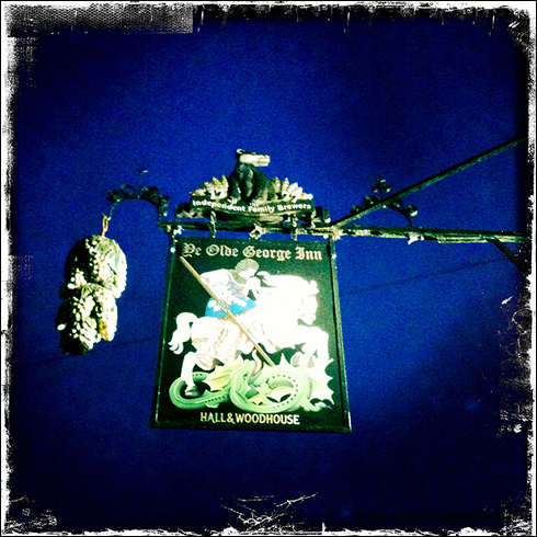
Once in Petersfield, we had nothing more than a fifteen-minute wait before our bus arrived… there's something beautifully relaxing about the fact you're out for the full day, the weather's on your side and you can eat and drink to your heart's content, knowing full well that you don't even half to think about driving or anything really. As we alighted the bus, we took in our first views of East Meon and what a stunningly beautiful village it is; full of English charm with many chocolate box thatched cottages, the River Meon running through its centre with quaint stone bridges across it. It didn't take us long before we clocked where the two pubs were in the village, the first being Ye Old George Inn, the second, a short distance up the main high street, Izaak Walton - more about those later.
After a fairly short walk through the village, we saw a few signs for the event, although there was a little confusion as to where the actual main entrance was. We obviously did find it, nothing was going to find a way between our hunger for a pint.
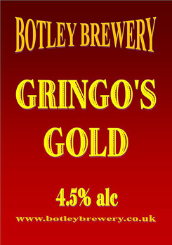
We started the proceedings with 'Gringo's Gold' by Southampton-based Botley Brewery, a brewery that none of us had encountered before, which is always welcomed. At 4.5% ABV, this golden ale possessed an incredibly pleasant fruitiness and a clean bitter finish, combined with the distinct hoppiness. A nice starter and very pleased to discover a new brewery in the process.
Please click on the pump clip above to find out more about the brewery that was founded just last year.
Since there were just eleven beers to choose from, there were only three we'd not tried before, the first of which I've just mentioned and another called 'Flowerpots Bitter' by Flowerpots Brewery in nearby Cheriton. It was great to see that Malcolm had Irving's 'Frigate' there and it was great to taste again (it had been a while!) Other familiar names were Bowman's 'Swift One' and 'Wallops Wood', Suthwyk's 'Liberation', Upham's 'Upham Ale', Oakleaf's 'Hole Hearted' and 'Double Drop' by Flack Manor. The remaining other ale we'd not tried before was 'Hallelujah' by Alton's Triple fff brewery, who also had their award-winning 'Alton's Pride' there.
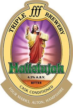
"Hallelujah' is a light-coloured and full-flavoured ale with a strong fruit nose. Brewed with Green Bullet hops from New Zealand, the ale tastes of pine and citrus flavours with a strong hoppy flavour and thirst-quenching bitter finish. Despite it being a 4.5% ABV ale, it packs a pleasant bitter punch.
To find out more about Triple fff Brewery, please click on the pump clip above.
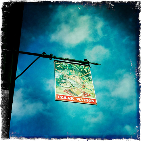
Midway through the afternoon, we were met by Jamie, who'd been working in the morning, so our regular supping squad was complete. We spent a further two hours there before deciding to make our way back into the village and test out the two pubs. Since the Ye Olde George Inn was the furthest away, we opted to go there first… big mistake, their opening hours were from 11-3… it was 15:20… back up the village to the Izaak Walton it was. Since it was a firehouse, they had three different beers on, Sharp's 'Doombar', Ringwood's 'Best Bitter' and Bowman's 'Wallops Wood'… Wallops Wood won hands down.
We spent the next couple of hours there, drinking, snacking, chatting and even playing pool. I hadn't played pool for at least six years, may have even been ten. I had an inkling that Damien would be a very good player and I also knew I'd be very rusty, having not played for so long. Sure enough, I failed to beat him first time round, him leaving me with all seven balls on the table. I then proceeded to beat him again, Jamie then playing the winner of that game… me. I beat him too and offered Damien another game, him drawing it level. The captain of the local pool team had offered to play the winner of our match and Damien beat him. He then asked me for a game and I also beat him, during which time, he'd asked the both of us if we fancied joining their team. We'd love to have done, only Havant to East Meon is quite some trek on a Tuesday night.
Anyway, it was a great pub and I've just realised, we hadn't put the pool table cover back on… oops… still, to find out more about the pub, please click on the photo of the pub sign I took above.
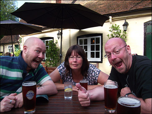
We then left there and made our way to the Ye Olde George Inn, a Hall and Woodhouse ran pub where we all enjoyed a pint of King and Barnes 'Sussex'. We sat out in the beer garden, soaking up what was left of the afternoon sun and Jamie kindly took this dashing photo of us all (see above).
It was then a case of going back up to the beer festival, sampling a few of the remaining ales, listening to the live band, 'The Shrubs' and just chilling out on straw bails (a seat, not an ale) before making our way back into the village as dusk was upon us. We enjoyed one last beer in the Ye Olde George Inn, a pint of Badger 'Tangle Foot' this time before ordering a taxi back to Petersfield Station.
For more information about Ye Olde George Inn, please click on the photo of the pub sign I took below.
We said our goodbyes to Jamie at Havant, as he was continuing to Portsmouth where he lives and then made our way to the Shapla Indian Takeaway in Havant where we ordered three takeaways… we then said goodbye to Damien and walked back home, ate it and went to bed. Healthy or what?!?!
Friday 24th June 2011 15:32
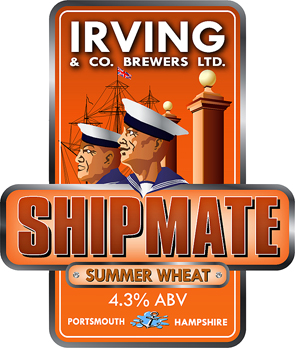
Since I had the whole day to myself today, it gave me a perfect excuse to finalise the latest pump clip design for Irving & Co. Brewers. Malcolm's latest ale will be called 'Shipmate' (as suggested by some of HMS Manchester's crew) and will be a 4.3% ABV Summer Wheat ale, very much a citrus-tasting ale.
With this in mind, Malcolm expressed that the pump clip be orange in colour, particularly as it's one of the few primary or secondary colours that hasn't been used yet. Malcolm had a clear idea of how he envisaged the final design, his text asking, "I'd like maybe an image of two sailors leaving Victory Gate if the gates of Victory and the masts of Warrior be sort of in the background. Orange in colour because we may add oranges and lemons to the brew."
So there was my brief, and very detailed it was too. Up until me starting the design, I had absolutely no idea what or where Victory Gate was, despite the fact I'd walked through it once and driven past it on numerous occasions. Thankfully, Google Maps came to the rescue there, and one particular view of it meant it would work perfectly with how I'd planned the layout.
Earlier in the week, I'd expressed my interest in Propaganda art, especially many of the Russian artists and I felt that this design would help convey the overall feel of the scene, rather than opting to head down the cartoon path. I feel Irving's identity is firmly on the map, and as my Dad said in an email, "Glad you've avoided going down the "Jim lad" route with the faces, as that would have been so predictable."
The last quest was to find a suitable image of Warrior, preferably one that matched its position in relation to where the gates were, for they're visible from the angle I found on Google Maps. I think it's essential that such research is as close as possible to being a true representation of where the elements are located. I found one and it took some time to draw, this being the most involved of all the pump clips so far.
There may well be a few tweaks here and there, but on the whole, Malcolm's first impressions were that he very much liked it.
Thursday 23rd June 2011 13:30
Received a brilliantly funny email from Dave, Tanya's boss, today. They were all submissions from people who had been victims of the iPhone's Auto Correct with regard to spelling. As you may well be aware, Smartphone devices can often change words without rhyme or reason, often resulting in some hilarious blunders along the way, especially if 'send' is hit too quickly.
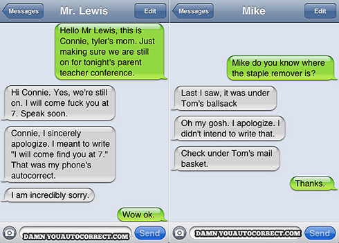
Luckily, there's a site where many of these blunders can be uploaded to, so people are able to share their embarrassing, questionable, hilarious or just plain WTF auto correct moments. I do have to question the authenticity of many of them though, for example, one of the ones I've included above… would you REALLY refer to your own identity as Mr. Lewis? Perhaps you would if it was a school 'phone. The other questionable thing is how many of these have since been 'staged' after the origination of this site? Nevertheless, if you have been genuinely screwed by predictive text such as the couple of examples above, please click on either to submit your own.
Wednesday 22nd June 2011 11:45
Discovered another very useful site today, especially for fellow graphic designers who have tight deadlines to meet. Part of the Graphics Factory CC network of sites, VectorTemplates is an internet company that specialises in design-related services and have now built up a fairly extensive library of vector art over the years.

Most of, if not all, the downloads available are in cdr, ai or eps formats and include templates such as apparel (t-shirts etc), country outlines and graphics, as well as world maps and also iconic cityscapes. There are many fun things as well, such as Batman and Superman logos.
Please click on the logo above to see what else is available on their website.
Tuesday 21st June 2011 22:38
Having watched the second episode of the new series of 'Luther' tonight, I thought it was time to find out more about the female singer who features on Massive Attack's, 'Paradise Circus'… someone called Hope Sandoval. One thing I also wanted to find out was whether she was as sexy as her voice. I wasn't disappointed.

Born in Los Angeles on June 24th 1966, Hope Sandoval has had an illustrious career, yet for some reason, she'd never been picked up on my music radar. Her musical genres slot into what would be described as dream pop and folk rock… basically seriously chilled out shit whichever act she's been associated with, and there are quite a few; Opal, Mazzy Star, The Jesus and Mary Chain, Massive Attack and her most recent venture, Hope Sandoval and the Warm Inventions.
For more information, please click on her namestyle above to visit her official website.
Monday 20th June 2011 08:19
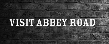
On the 26th September 1969, saw the last recorded album by the biggest rock band we've ever known. Featuring tracks such as 'Come Together', 'Something' and 'Here Comes The Sun', it was the album cover that made it equally as famous, with people today, still wanting the recreate the iconic photograph of all four of them crossing that now famous zebra crossing in London. My mate Lee sent me an email relating to the location of that very same zebra crossing, which is why it features on today's blog.
We are of course talking about 'Abbey Road', the eleventh album recorded by The Beatles at three different studios, EMI being the one based on Abbey Road. The front cover was based on sketched ideas by McCartney and taken by Iain Macmillan on the 8th August 1969. He was given just ten minutes to capture the right photo (obviously using film back then, so undoubtedly more tricky), whilst stood on a step ladder with a policeman holding up the traffic.
Other trivial bits of information regarding the shot are that Lennon is leading the pack, followed by Starr, McCartney and Harrison. McCartney is barefoot. With the exception of Harrison, all the others are wearing suits designed by Tommy Nutter. The VW Beetle, parked to the left and next to the crossing, had its number plate repeatedly stolen after the album was released. Sold at auction in 1986 for £2530, it's now on display in a museum in Germany. The final bit of trivia relates to the man standing on the pavement to the right of the photo who was an American tourist, Paul Cole, unaware he'd been photographed until he saw the album cover, months later.
To view a live webcam of the zebra crossing, please click on the image above. As Lee said, "You can see visitors trying to recreate the cover if you watch it long enough. I watched it for two minutes and it didn't take long for some people to stop traffic to take photos. It's kind of hypnotic."
Sunday 19th June 2011 17:58
We did manage to leave the house today and get a bit of fresh air in Emsworth, other than that though, I spent most of my day going through all the commercial photographs I'd taken for various clients over the years, so that I could complete the photography section of my new design site. Other than that, it was another rather uneventful day, so since that was the case, I thought I'd stick to the subject of birds, and quite possibly angry ones, although these may well be described as angry real birds.

It seems that there are two split conclusions as to why many of our songbird species are literally dying out, in fact it's been the topic of conversation on both BBCs 'Countryfile' and 'Spring Watch'. In one corner are the representatives for Corvids (such as Crows and Magpies), whilst in the other corner are the representatives for the Songbirds (Corn Buntings, Bullfinches, Skylarks, Lesser Redpolls, Tree Sparrows and Song Thrushes).
Songbirds are suffering and there are many contributing factors towards these alarmingly low figures. Some blame the Crows and Magpies for either eating the eggs in songbird's nests or actually eating the bird's fledglings alive.
Probably the two most shocking drops in certain songbird species have to be the Corn Bunting and Lesser Redpoll, both down by 90% and the Tree Sparrow, down by 89%. It's not just the Corvids that are to blame though, it appears that many changes within their habitat have also been a major cause. Either way, it's frightening to think that certain species of songbird may well not be around in another generation or so.
A charity, Songbird Survival was set up to help keep our songbirds very much part of our lives, to find out more, or to make a valuable donation, please click on the logo above.
Saturday 18th June 2011 22:06
Another rainy and windy weekend day… and we're in the middle of June! I had woken up very early so decided to make a start on the latest pump clip design for Irving & Co. Brewers. As yet, I won't disclose what the ale is called, because it's a totally new seasonal one… all I can say is that it will be a citrus ale, with a distinct orange taste.
Anyway, since it was a total washout today, other than spend time on the new design, Tanya and I spent quite a lot of the day playing a stupidly addictive game on our smart phones. In some respects, I'm utterly pissed off that I've jumped on the bandwagon, yet it is an enjoyable game and does while away the hours!
Yes, it's 'Angry Birds'. How addictive is it?!? Very, is the answer. We spent hours and hours playing it, and I've since found out that you can play it online.
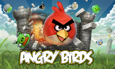
So what is it? Well, predominantly, it's a puzzle video game developed by the Finnish company, Rovio Mobile. It was originally inspired by a sketch of characterised wingless birds and the game was first released for Apple's iOS on December 10th 2009. Since then, over 12 million copies of it have been purchased vis Apple's App Store which then prompted the company to develop it for other touch-screen smartphones, such as those using the Android operating system.
For those without smartphones, the fucking thing is also available to play online now… cluck on the logo above to become another addict...
Friday 17th June 2011 09:00
Had a meeting with Tanya's boss, Dave, this morning as I had an awful lot of work to discuss with him. He'd only just come back from a business trip in The States and had kindly brought me a couple of beers back from two micro breweries, one based in California, the other in Montana.
I've become fairly accustomed to American ales, especially as some of the major supermarket chains stock certain ones, such as Sierra Nevada and Flying Dog, two that spring to mind instantly.
Anyway, these particular ales were 'Moose Drool Brown Ale' brewed by Big Sky Brewing Co, based in Montana, the other was 'Red Rocket Ale' brewed by Bear Republic, based in California.
'Moose Drool Brown Ale' is a 5.1% ABV dark ale, slightly fizzy and full-bodied. Malty in flavour with caramel notes and a fine balance of hoppiness, the ale has a bitter sweet finish. Brewed with Kent Goldings, Liberty and Willamette Hops. Very pleasant ale.
For more information about Big Sky Brewing Co, please click on the logo above.
Bear Republic's 'Red Rocket Ale' suggests that that's what it is, especially at 6.8% ABV. I have to say, I was quite taken aback with how strong and sweet this tasted. It was delicious and had a superb fruity aroma. It's based on a bastardised Scottish-style red ale, packed with distinctive flavours and an aggressive hoppiness. A superb ale.
Please click on the logo above to find out more about the Bear Republic Brewery.
Thursday 16th June 2011 10:29
At the moment, I'm doing research for two quite closely related designs. One is for a military-based website, the other is for a new pump clip for Irving & Co. Brewers. Having searched the internet at some length, I feel that both designs would suit the art deco feel, almost reminiscent of some of the famous Soviet propaganda posters, although the pump clip would be slightly removed from the Communist colours, it's more the stylisation of light and shade, known as chiaroscuro, that appeals to me most.
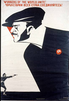
The propaganda poster style is still popular today, with many graphic designers creating new takes on famous posters from anything up to one hundred years ago.
Some of the most famous have to be the Russian artists at that time, Dimitri Moor being the one who literally changed the face of graphic design back in 1918. His work dominated both the Bolshevik Era (1917-21) and the New Economic Policy (1921-27). With pressure put on Russian workers to rise up against imperialism, much of his work highlighted the stark contrast between the oppressive evil and the heroic allies.
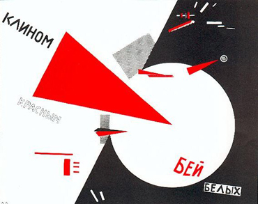
There was also El Lissitzky, one of the fathers of suprematism, along with Kazimir Malevich, who changed the face of typography, exhibition design, photo montage and book cover designs, so much so that many of the modern techniques we see today are a direct result of Lissitzky's work.
Later still, Strakhov Braslavskij was known for poster artwork that promoted the emancipation of women, touching on the fact that gender equality was growing. These women were seen as supporters of Communism, needing to be freed from their duties as wives and mothers.
Valentina Kulagina was one of the few female poster artists to emerge from this period. Her art was heavily influenced by suprematism, bearing similarities with that of Lissitzky's. The 1930 painting 'To Defend USSR' has to be one of my favourite propaganda posters, showing an almost cubist style of painting and depicting the Red army as marching giant robotic figures.
Wednesday 15th June 2011 11:40
On a regular basis, I design graphics for vehicle livery, and even more frequently, bike graphics. There are several ways of producing graphics, one of which is sending them out to a specialist printer, especially if full colour artwork is involved, however, if it's a relatively simple design I'm able to create vector-based artwork (with all fonts outlined) and cut the design myself.

Metamark is, The Materials Company and have to be one of the leading suppliers of self-adhesive sign vinyl and digital media for solvent inkjet printing. Established in 1992, their products are specified or used by sign and digital professionals around the world. Not only do they supply them, they make them too and their manufacturing, selection and conversion processes guarantee the highest standards of quality, technical compatibility and consistency in the industry.
To find out more, please click on their logo above.
Tuesday 14th June 2011 21:00
Tonight saw the second series of 'Luther' start on BBC1. Created by Neil Cross, the hour-long programme is a British psychological crime drama starring Idris Elba as the title character, Detective Chief Inspector John Luther. The first series of six episodes ran from 4th May to the 8th June in 2010, and since then it's been premiered in both Australia on ABC1 and in the United States on BBC America.
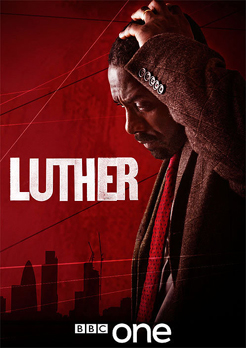
The edgy second series had me sat on the edge of my seat for almost its entirety where a surreal and nightmarish case of a masked murderer was determined to enter into folklore. I won't go into anything else about the episode because it's well worth watching and I wouldn't want to spoil anything for you. As with the recent series of 'The Shadow Line', this programme has a superb opening theme as well, 'Paradise Circus' by Massive Attack.
Anyway, without further ado, please click on the programme's title screen above to find out more.
Monday 13th June 2011 21:45
I'm certain that no matter what career path you might have taken in life, there are certain types of advertising and media that you will always come into contact with. In some respects, as a graphic designer, there are many publications that are very interesting indeed, particularly the one I shall be talking about today.

Owned by Centaur Media plc, the weekly 40,000 issues, means that 'Marketing Week' is one of the biggest magazines focused on the marketing industry in the UK. Launched in March 1978, its co-founders were Michael Chamberlain, a former editor of the advertising journal, 'Campaign', along with Anthony Nares, an entrepreneur who set up Marketing Week Communications shortly before the launch. The London-based magazine is headed by Publisher, Sarah Gilchriest and Editor, Mark Choueke.
To find out more about the publication, please click on their logo above.
Sunday 12th June 2011 14:35
I'd hope that the people I know associate me with a GSOH. What my wit would be described as is anyone's guess, but do I give a fuck? No, really? Okay, I suppose I do but we'll keep that between us and the world wide web, right?
Since today's weather was what was probably expected yesterday, we did absolutely bugger all apart from sit in front of our computers all day, which for me, was a rather good thing, since I have quite a lot of work to complete tomorrow and would also like to continue with my design website (Is this actually going anywhere? - Ed). So, that's what I spent the day doing, catching up with this 'ere blog.

The only thing I did of any worth was submit my Word of the Day, yes, I'm still doing it, although I haven't updated the page I created in months. As you know, I like words that are either onomatopoeic, sound funny or sound interesting… so I decided to Google, 'funny words' and discovered a superb website in the process, which is why I was questioning my humour earlier (Fuck me, talk about going off on tangents, you freak! - Ed).
Anyway, I ended up on a site called, 'Inherently Funny', and it is. It's full of all kinds of stuff that's both funny and within the realms of decency too.
Rather than tell you about it, just go and have a look for yourself - the words section is just great.
Saturday 11th June 2011 12:00
Despite the weather forecast indicating the contrary, today ended up being quite a nice day, although when the sun disappeared behind cloud, it was chilly. Just seems crazy to think that in March, our weather was far warmer than it is right now, and we're as good as in the middle of June.
Since returning from Lundy, neither of us had seen Abbi and she'd been in touch to see what we were doing today… I'd already mentioned to Tanya that I fancied visiting a 'village' called Tyneham in Dorset - I won't go into that right now, as there's every chance we'll go next weekend instead.
We'd looked at other places to visit as well, most of which we've either exhausted or they were a little expensive, especially as money isn't great right now, after the backlash of Lundy. In the end, Tanya suggested we all go to The Garden Show, held at Stansted Park over this weekend. Reluctantly, I agreed to go, although I was in a work frame of mind… desperately wanting to progress the design of my design site.
Anyway, I'm glad I did go, even though it was quite a steep £8.50 per person entry fee, because we all thoroughly enjoyed ourselves, plus there were a wide range of things to look at. It wasn't just plants and garden-based things, there were many art and design-based stalls, including photography, ceramics, jewellery, paintings to name a few, as well as loads of food and drink stalls. Two real ale breweries had also found their way there, much to my delight; Ballards and Fallen Angel breweries.
To find out more about The Garden Show events, please click on the logo above.

Since there were so many stalls, I'm not in a position to talk about all of them, however I will mention three that caught my eye one way or another. The first was Cooden Cellars, which seemed to be part of the Fallen Angel stall. They're an independent wine merchant, established by partners Colin Barnes and Ian Jarman and were founded in 1997, originally intending to open a shop in Cooden Beach (hence their name) but eventually decided on their current premises in Eastbourne. I also wanted to talk about the company because I rather like their understated logo. A slight pity though, because their website doesn't leave me feeling the same way.
Please click on the logo above to find out more.
We were as good as in our element around the food and drinks tent… sampling many of the delights on offer and being guided around, almost as if blindfolded, by the superb mix of aromas being emitted from every stall. Once outside, we were enticed by a scrumptious-looking stall, simply named Just Strawberries and, essentially, that's what it was, although you could buy strawberry tarts, strawberries with cream etc., etc., but we all understood what it was about. I'd provide more information about the company but there's little information on their website.
To make your mouth water, please click on the logo above.
Finally, as we were visiting the last handful of stalls on our route out, I spotted a sky blue Austin Healey 100/6, as well as a pristine VW Camper Van, both of which were on display by a company called Vanilla Classics. Based in Barnham, fairly close to Goodwood in West Sussex, they have a showroom full of classic cars, all available for hire, whether it be for a day, or even for a wedding. As they say, "if you can dream the adventure, we can make it happen."
To view their stunning range of vintage cars for hire, please click on the excellent retro logo design above… and for you font buffs out there, 'Classic Car Hire' is in ITC Mona Lisa, whilst the Vanilla Classics is set in Serif Gothic Regular.
Friday 10th June 2011 15:48
Today I actually got my arse in gear. You may recall me mentioning that I'd redesigned my igdesigns logo back in July of last year, and I'd also made a start with an idea for the banners for each section. At the time, the inspiration and motivation wasn't there, don't ask me why, it's just the way it is sometimes. I guess I find it harder to motivate myself with my own work, yet it can sometimes be as important as the paid work.

Tanya has been insistent for months and months about how important it is/was for me to update the look of the site, especially as the old one was as good as defunct. I totally agreed with her, as I said, it was the inspiration and drive that were lacking… until today that is.
There is still some way to go with this, yet I'm incredibly excited about the progress I made with it today and how everything seems to be falling nicely into place. The copywriting for it needs to be precise, and I desperately want to include some of my blog wit on there (Oh, for fuck's sake! - Ed).
Anyway, for the moment, please click on the image above and have a look around, taking time to look at the various bits of trivia under each banner image - oh, and the websites section is as good as complete.
Thursday 9th June 2011 18:11
The loss of someone or something close to you is always a difficult thing to come to terms with, as I found out tonight. After some deliberation, my sister Elise and brother-in-law, Dave, made the unenviable decision to have their dog, Hudson, put down tomorrow. I remember him as a puppy and the many happy times I had with him when they were on holiday and I became dog sitter.

Hudson is a Golden English Cocker Spaniel and is mad as a hatter, with an absolutely superb temperament and, when he finally says goodbye to this world tomorrow, Elise and Dave would have had him for exactly 15 years, to the day. Despite the fact I hadn't seen him for quite some time, he always remembers me and made an absolute fuss. A superb dog and even though it's inevitable that they can't live forever, it's still hard to comprehend. Such sad sad news.
A downloadable booklet from a website called 'dogsmatter' can be found by clicking on the leaflet cover above.
Wednesday 8th June 2011 13:27
In about a month's time, Apple will be releasing the latest version of OS X, the operating system for Mac. Version 10.7 will be named OS X Lion, which sort of suggests that this may well be the last version before it then becomes OS 11 or whatever it may be called. Then again, there may be a 'White Lion', who knows…

Strangely though, the first version of OS X was called 'Kodiak', named after a bear (although that was a Public Beta version) yet the subsequent ones have been 10.0 Cheetah, 10.1 Puma, 10.2 Jaguar, 10.3 Panther, 10.4 Tiger, 10.5 Leopard and 10.6 Snow Leopard.
Anyway, it all looks rather exciting, and rather than rant and rave about it, I'll just provide an image that links you to the OS X Lion webpage.
Tuesday 7th June 2011 22:08
I've been very busy these last few days, barely having the time to do such things as my blog, so it's just as well I constantly make notes about the goings-on of each day of my life. I spent the majority of the evening drawing and designing a sheet of 'Wireless Accessories', and although I'd drawn most of the illustrations last night, there were still a couple to do, along with a change for one of them… this needing a spreadsheet icon, rather than the printer I'd previously drawn.

This meant me hunting around for something to refer to on the internet (bearing in mind that anything relating to the word 'spreadsheet' is so typically PC… I believe the Microsoft Word spell checker keeps trying to default the word to 'spread shit'). So, whilst hunting around, I found a very useful site that provides references to virtually any graphic icon you can think of, that site was IconsPedia, 'your source of free icons'.
Launched in 2007, IconsPedia has attracted some incredible contributors, with the quality of their icons and the fact that they're free, being an even bigger draw for graphic designers (Ha ha! - Ed). The site now has a strong following through RSS, Twitter and Facebook, so if you frequent such things, it would be as well to subscribe to them. As well as all of this, you can join their community and participate whether it be for free, or whether you opt for a premium account because for as little as $11.97, it's more than worth it.
Please click on the logo above to find out more.
Monday 6th June 2011 21:49
Since talking about the seven deadly sins yesterday, I opted to choose 'Greed' as being my shot for today. You may well recall that I've done a couple of other images based on this sort of theme, namely 'The Mannequin Project' back in December 2007, followed by 'The Arachnid Catastrophe' in September 2009… it may seem as if the ideas I have for these are two years in-the-making, only they're not… they're incredibly spontaneous and, in some respects, I'm glad that my mind isn't bombarding me with other ideas… I quite like the two-year gap thing that seems to be going on.
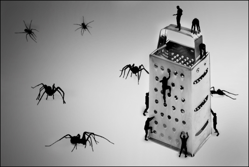
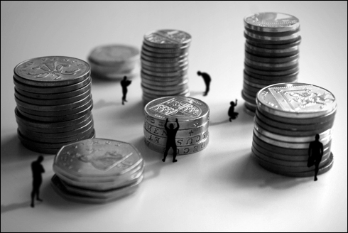
Anyway, since I've spoken about the other two images of this series, I thought I'd show all three… this new one related to one of the seven deadly sins is called 'The Greed Credence'.
Sunday 5th June 2011 20:39
Spent virtually all day catching up with images, updates and my blog, all on this very website. It's amazing how quickly you can fall behind with such things and, having written about something every day for about three and half years, I have no intention of stopping now. It just amazes me how much time I do actually spend doing it and I'm sure I'd miss it if I suddenly decided to call it a day.
The fact that my new, 'Even Crazier 365+1 Bit' is probably taking up even more time than my previous 'Crazy 365 Bit' can take its toll at times, although I've been enjoying the latest project that my friend Lisa set me… "How about each one of the deadly sins to keep you going for a week?" Up until today, I'd covered 'Gluttony', 'Sloth', 'Wrath' and tonight's one was 'Pride'… as much as I'm not bothered about being naked, 'Lust' is going to be a tricky one, especially as I post these on Facebook… a place where my parents frequent, as well as my two young nieces…
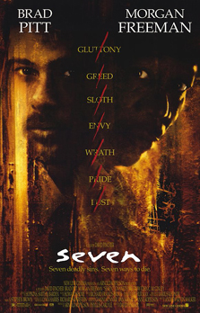
Anyway, the seven deadly sins were made very famous back in 1995 when director David Fincher and writer Andrew Kevin Walker created a superb thriller called 'Seven'. Starring Brad Pitt, Morgan Freeman, Gwyneth Paltrow, R. Lee Ermey and Kevin Spacey, the film grossed $327 million at the box office internationally and was a huge commercial success, gaining positive reviews from most critics.
In a nutshell, David Mills (Pitt) and William Somerset (Freeman) are police detectives who become deeply involved in trying to fathom out who was conducting a series of sadistic murders. It's not long before they realise that each one corresponds to one of the seven deadly sins: Gluttony, Envy, Lust, Pride, Sloth, Greed and Wrath.
To visit a multimedia website about the film, please click on the movie poster above.
Saturday 4th June 2011 20:00
I was going to say that I sat down and watched an unforgettable performance at Wembley with a Euro 2012 qualifier between England and Switzerland, however, that wasn't the case. To be honest, the fact that they were playing had totally escaped my memory, and I'm glad it did… because when I finally realised they were, it was about the 40th minute and they were losing 1-2. Great.
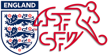
Tranquillo Barnetta had managed to score two goals in quick succession, both from what would be classed as speculative free-kicks, one in the 32nd minute, the other in the 35th, with England reeling, especially as they were expecting this to be an easy tie, keeping them in prime position in their group. As it stood, Montenegro had every chance of taking advantage of this result, with the possibility of squandering England's chances of automatically gaining their ticket to the finals.
Luckily though, a dreadful defensive error by Johan Djourou on fellow Arsenal team-mate, Jack Wilshere, provided the lifeline England needed before half-time, with Frank Lampard converting, the shot going underneath Swiss goalkeeper, Diego Benaglio.
England started lively in the second half but it wasn't long before the ridiculously frustrating team that didn't seem to possess any drive or passion reared its ugly head. What is it with England? Why can't they gel as a team, why does their midfield seem to allow players to run right at (and through) them? Their performance was absolutely pathetic, and it was only until Ashley Young substituted Frank Lampard in the 46th minute that things actually started to happen.
Actually, I really can't be bothered talking about the match any more, other than to say that a chest down by Leighton Baines, followed by a beautifully weighted chipped pass into the path of Ashley Young, provided him with a low-angled finish that left the Swiss 'keeper flailing. Full time result, 2-2. All was not lost.
Friday 3rd June 2011 19:32
Every now and again, if the mood takes me, I'll sit down and watch BBC One's 'The One Show', especially as Chris Evans fills his foots on a Friday, with the show being extended to an hour, rather than the usual half hour.
Because of this format, they're able to cram in even more subject matters (not that that has ever been detrimental to the format), and these include the usual features such as 'Jay's Foody Friday' and One Show street hairdresser, Michael Douglas who travels the country cutting people's hair. This week he was at Spurn Point, a narrow sand spit on the tip of the East Riding of Yorkshire coast. It reaches into the North Sea, and is of a similar shape to an elongated tongue, stretching over three miles long and is as little as 50 yards (46m) in places.
Spurn Bird Observatory was formed following visits there by several members of the Yorkshire Naturalists' Union in the late 1930's, a communal log for ornithological observations was instituted in 1938. This included a roll-call of species, the beginnings of a recording system, which later became standard in bird observatories. Realising the potential of the Spurn peninsula for the regular observation of bird migration a group of enthusiasts, notably Ralph Chislett, George Ainsworth, John Lord and R.M. Garnett, had the idea of setting up a bird observatory, with the Warren Cottage at the northern end of the peninsula as an ideal headquarters.
Thursday 2nd June 2011 16:25
It was literally a couple of weeks ago when Tanya came home from Damien's waxing lyrical about a tea that he has and how tasty it was and you hardly had to swill the bag around in the cup. I'm quite passionate about how tea tastes, and I can really do without all that herbal stuff, so to say I was reluctant about it was an understatement.
For me, a day should start with, "a nice cup of tea", unless of course, you're on holiday, and then it's best to start the day with "a nice cup of coffee". Don't ask me why this rule applies, it just does, and I've since found that other people apply the same rules. Either it's normal, or I just know a lot of weird people. Probably the latter.
Anyway, I'm rambling on aren't I? (You could say that - Ed) The tea in question is called, 'Punjana' and despite its name, the company who blend the tea, Thompson's Family Teas, are based in Northern Ireland's capital, Belfast. They're a family-owned company, who are as passionate about tea as I am, and first started when the grandfather of the current generation first started blending over one hundred years ago.
Since then, the company has gone strength to strength and now source the finest ingredients for a range of eight different 'speciality' Punjana teas; Original, Irish Breakfast, Fairtrade Tea, Decaf, Earl Grey, Peppermint, Camomile and Green Tea. The teas and herbs are sourced from the finest producers in the world, from growers who share the same ideals in treating workers fairly, giving regard to proper wages, healthcare and education.
To find out more about Punjana and Thompson's Family Teas, please click on the logo above.
Wednesday 1st June 2011 15:21
Whilst hunting around for a particular logo today, I stumbled upon a really old publication that had been scanned in and had had a PDF created from it. When I say, "really old", I suppose I have to be careful in that my parents were both around in 1959, yet the actual advertising within this publication looks so dated - it's just great.
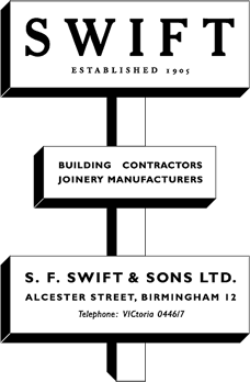
Common fonts back then were, Gill Sans, Lubalin Graph, Times, Eurostile, Trade Gothic, Bodoni No2 Ultra, Rockwell and Copperplate Gothic, to name just a few. I find it hard to comprehend how, in just over 50 years, advertising changed so radically.
There are a handful of companies within the magazine that have actually used a logo of some sort, the rest rely on a mixture of fonts in their advert, certainly nothing like the glossy ideas you see nowadays, using high-key imagery and instantly recognisable branding. What amazes me further is how there are at least half a dozen fonts that I have absolutely no idea as to what they are.
So far, I've managed to pinpoint just one of the adverts where the company is still going, an advert for the 'Dandy 70', a scooter manufactured by BSA, every other company has gone, one way or another, which is sad really, but then again, recent governments have made sure of that.
Anyway, since it was a relatively easy graphic to redraw, please click on the Swift advertisement to view the PDF I've been talking about.