Wednesday 30th June 2010 22:18
Thought I'd finish on a funny note this month, especially as it's been the first time in weeks that I've actually been up-to-date with my blog. Having that time tonight has given me the impetus to have a long hard think about what I can talk about.
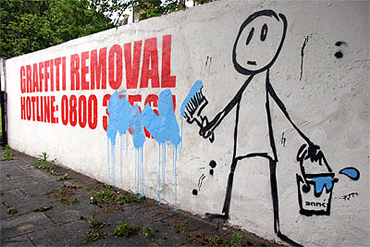
Today's blog was actually inspired by someone else who's joined us on the 365 project. Mike Crowe began at the beginning of June so he's exactly 31 days behind the rest of us. I noticed that his image for yesterday was of a bus stop, but it wasn't a bus stop that the majority of us are used to seeing, this one was of the nearest one to Stover Park nature reserve and has a very ornate dragonfly mosaic inside it.
Mike touched on the fact that he has every intention of presenting a talk at his local photography club all about the variety of shelters you see, the people that are making use of them and the sometimes ridiculous locations you see them in. Without sounding sarcastic, it could prove to be a very entertaining talk.
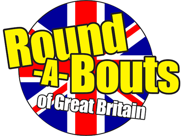
As with most subjects that can be typed into a Google search, I decided to see if there was some Bus Stop Appreciation Society… amazingly, it looks like Mike may well have found a unique subject matter to photograph and do a talk on, but I needed to remind him of the 'Round-a-bouts of Great Britain' website, I kid you not.
Back in 2002, several members of staff at a Redditch-based printing company were stumped as to what kind of calendar they could send out to their clients on the run up to Christmas. The staff at B.B. print Digital Ltd were totally bored with the usual assortment of Beckhams, Jordans, naked old ladies and six-pack firemen… so they began to rack their brains and came up with possibly the most unique calendar in history… 'The Roundabouts of Redditch', 12 stunning shots of the very best traffic islands Worcestershire had to offer.
Rather than provide any more information about them, just click on the logo above to find out just how mad they all are.
Tuesday 29th June 2010 13:35
I received an email today from a company I'd never heard of. Now then, you may say that there are millions of companies out there who I'll never have heard of, and you'd be right.
The thing is though, this particular company is a market leader in creating highly simple and accessible ways for people to work with digital imagery… see, now you're shocked, aren't you?

Vertus is one of the proprietary leaders in image technology, especially in both segmentation and matting. Segmentation allows images to be automatically broken down into clean and natural shapes, much like the way our eye/brain combination visualises things. Matting ensures that the edges of these shapes are preserved for when they are recoloured or transferred to new backgrounds.
The whole product range from Vertus has been tried and tested, consistently being rated with excellence to the point where their flagship product, 'Fluid Mask 3™' has been rated the No.1 Still Image Masking Tool on the market. Other products such as 'Play With Pictures™' and 'Bling! It™' have also received wide acclaim from professionals and amateurs alike.
To find out more, please click on the Vertus logo above.
Monday 28th June 2010 22:32
Some time ago, I stumbled upon one of the many free font sites that seem to grip the internet's short and curlies. Free font sites are brilliant, particularly ones that hold no airs and graces and have a rather groovy logo to boot. FontSpace, the site in question, are exactly who they say they are, ' a community of font designers and font addicts.'

The fact that they're all free means that many fonts on the site are new and interesting, with almost 9,000 different ones to download, whether you choose to use them for your blog, a website or just to use on your own computer. FontSpace features user-generated content , as all of their fonts have been created by designers. The designers can upload, tag and categorise their fonts, as well as personalise their own designer profile. The tagged fonts give you the option of browsing fonts by 3000+ categories, keywords, alphabetically or by designer. If you sign up for a free account, it then allows you to bookmark, rate and comment on fonts.
Unlike many other font sites, FontSpace doesn't brag about its professionalism which makes it appealing to a far broader spectrum of web users, however they do plan on expanding the site so that they include a section which purely features the high-end of font designers which users and visitors would have to pay for.
Please click on their ultra-cool logo (which I ended up redrawing) above to have a look at the fonts available. By the way, the majority of the logo is in Avant Garde Book.
Sunday 27th June 2010 15:00
Awoke this morning knowing that it was going to be a great day for football and England. The day was set, sorted out some important bits of work and then settled down with my beers so that we could both enjoy the World Cup tie between England and Germany. As any football fan will know, Germany have to be England's jinxed team for their luck seems to be totally obliterated when it comes to playing them.
Since all the hype has been directed around the fact that England has its best team in years and are managed by one of the very best in the business, what could possibly go wrong?
Everything is the answer to that. Apart from a very well taken header by Matthew Upson which made the scoreline 2-1 to Germany at the interval, there was very little else to praise England on. In fact, I really don't want to talk about the match. But before I leave you with a paragraph of descriptive words that epitomise England's performance, I also want to point out how ridiculous the referee and linesmen were during the game, disallowing a perfectly good goal by Frank Lampard which was a good foot across the goal line.
Anyway, rather than go on about how bad the England squad were, I shall leave you with a couple of parting words that describe their performance… abysmal, dreadful, awful, terrible, frightful, atrocious, disgraceful, deplorable, shameful, hopeless, lamentable, rotten, appalling, crummy, pathetic, pitiful, woeful, useless, lousy, dire, the pits, grim, horrifying, alarming, shocking, distressing, harrowing, ghastly, fearful, horrendous, tragic, calamitous, grave, disastrous, ruinous, irretrievable, wretched and desperate.
Think I've just about covered it.
Saturday 26th June 2010 11:07
I've been meaning to say that apart from the 11th June, I cannot recall seeing any rain this month, it's been absolutely amazing weather and the temperatures for the past week or more have been well into the 20s, tipping the 30s on occasions. This, I have to say, has been somewhat frustrating, especially since Tanya has been as good as housebound since a week last Friday.
Anyway, in preparation for England's World Cup game against Germany tomorrow, I decided it would be a good idea to buy a few beers in and since I'd been given the task of hunting down a reasonably priced kettle (ours blew up a week last Friday) and also seeing if I could buy some sun loungers, the beers were a necessary step forward in my double-edged quest.
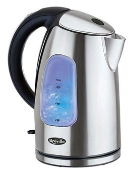
So, off I went to B&Q, in the hope that they'd have the ultra-cool stripy sun loungers we'd seen online, only to find that everyone else in the whole of the area must have had exactly the same idea. Never mind, ASDA may prove to be a success, and even if they weren't, there was still the kettle to look for and obviously the beers.
What was great was that I ended up leaving ASDA with everything I'd gone out for. I managed to find two fairly basic sun loungers for just £10.00 each, which I thought was incredibly good value for money, a Breville 'Brushed Stainless Steel Jug Kettle' for just less than £25.00 and six beers for £8.00. I left the store a very happy man and from there we both just chilled out for the rest of the day.
To find out more about the range of products available from Breville, please click on the image of the kettle above.
Friday 25th June 2010 14:14
Ever since 1966, the World Cup has had a mascot designed for it, back then, it was World Cup Willie and more recently, Italy 1990 had 'Caio', a stick figure football player decorated with the colours of the Italian flag. In 1994, the United States had 'Striker, the World Cup Pup' with the France 1998 mascot being 'Footix' a rooster, one of the national symbols of France. This year's mascot for South Africa is 'Zakumi', which is a cartoon leopard, the green and gold colours representing the South African national sports' team colours. His name derives from 'ZA', the ISO 3166-1 alpha-2 code for South Africa, and 'kumi', a word that means 'ten' in various African languages.
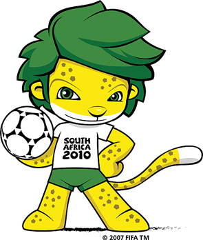
The original creator of the mascot is Andries Odendaal from Cape Town, and the mascot costume itself was produced by Cora Simpson of Cora's Costumes cc in Boksburg. Born in 1994, the same year as South Africa's democracy, Zakumi is a proud South African and an ideal ambassador for the first African World Cup, apparently.
To find out more about this totally fictional character, please click on the mascot above.
Thursday 24th June 2010 16:04
Had a totally different day today… far from the norm. As part of many schools' initiative schemes, I had been asked to allow two school pupils to 'work shadow' me. Luckily I'm not the sort of guy who shies away from such things, particularly as I do like to pass on my knowledge to potential designers or photographers. The only reservation I had though was the fact that they were both 13 years old and both girls. Apart from spending time with girls of that age when I myself was that age, I was somewhat clueless as to how to be with them… on the one hand they were still girls yet they were also maturing women.
The plus point was that they were both eager to learn and both had an interest in aspects of what I do for a living. Ellie had a huge interest in graphic design, whilst Millie had a major interest in photography and both were looking for careers in their respective interests. I briefly showed them some of my day-to-day routines and the standard of work I produced and then set them a task.
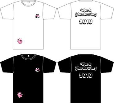
Since there was only one computer available, it was somewhat difficult to ask them to design anything via Illustrator or Photoshop, plus the fact that they'd heard of Illustrator yet hadn't used it enough to take any designs further than paper. So, rather than have them sitting there, probably becoming increasingly bored, I set them the task of designing a bespoke t-shirt for themselves, that could then be replicated via Illustrator and printed as vinyl transfers. Once I'd made the suggestion, both their eyes lit up so I know I'd won them over (Yes, looking somewhat like a Crimewatch photo-fit must've scared the living daylights out of them - Ed).
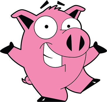
In preparation for today, I'd managed to dig out an old Letraset book I'd had since 1986 so they had some reference to the fonts available. So between them, they agreed on a font they liked, a design using the first initials of both their names that Ellie had designed and a graphic of a pig that they liked via a Google Image Search.
I have to say that some of the doodles Ellie made were excellent and she most certainly has a vision and natural skill for graphic design. Millie definitely had an eye for fonts and it wasn't long before she'd chosen a very retro font called, 'Octopuss Shaded' which was going to be used for the lettering on the back of the t-shirts. The pig graphic they chose wasn't just cool but was also perfect for a private joke that they found very funny.
So, a totally knackering day yet one that I thoroughly enjoyed, despite feeling somewhat apprehensive about it all.
To download a vector-based PDF of the pig graphic, please click on the pig image above.
Wednesday 23rd June 2010 15:00
Managed to get back home in time for England's last group fixture which was a must win contest against Slovenia. If England won and the USA either lost or drew their simultaneously played match against Algeria, England would finish top of their group and qualify, if England won and the USA won, the USA would qualify and finish top of their group. There was also the slim chance that England could go through on a draw, so long as the draw was a significant amount (I think that's right).
Anyway, not only did I manage to get home in time, I also managed a much needed trip to the off-licence so that I had some beer to drink, for we know all-too-well that watching England is stressful.
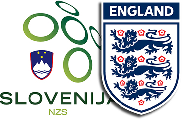
It's hard to say that there was much of an improvement with the England side, truth be known, although the team did manage to play with a little more passion than their two previous encounters with the USA and Algeria. England did start the match very well, with Slovenia hardly having a look-in and the hard work paid off because in the 23rd minute there was finally a touch of brilliance. Glenn Johnson accelerated down the right flank, laying the ball off to Frank Lampard who made a simple pass to Gareth Barry. It was then passed quickly to James Milner who controlled the ball beautifully and then fizzed an inch-perfect cross which almost curled away from Slovenian 'keeper Bojan Jokic which was met by Jermaine Defoe, slotting a superb volley into the back of the net.
The England fans were finally rewarded with mass hysteria and that's how the game finished Slovenia 0-1 England… the downside being that England meet Germany in the last sixteen. Arse.
Tuesday 22nd June 2010 09:12
One key that's unique to Apple Keyboards is the Command key, also known as the Apple Key. The modifier key is usually found either side of the space bar, although it wasn't introduced to the Apple Keyboard until it appeared on the Apple III, released in 1980, with the Apple Lisa only ever possessing the closed Apple logo.
In 1984, when the first Macintosh computers became available, the keyboards had a single command key with a Saint John's Arms (also called a four leaf clover) symbol. The reason for this was because Steve Jobs thought that by showing the Apple logo throughout the menus as a keyboard shortcut was 'taking it in vain'.
The subsequent keyboards had a variety of keys until 2007 when the Apple symbol was removed from the keyboard's redesign, making way for the word 'command' on US keyboards and simply 'cmd' on the European ones. Needless to say, the removal of the symbol caused outrage among some Apple enthusiasts, especially as they felt the unique design feature was being ousted for no apparent reason.
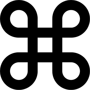
The function of the key has a single purpose, allowing the user to enter keyboard shortcut commands to GUI (graphical user interface) applications. A small set of shortcuts can be obtained via the command key, such as cut and paste, open and save and are standard across nearly all applications.
Since Steve Jobs expressed the fact that the Apple logo was being overused, especially as it filled up the Mac's menus next to the key commands, it was only a few days before the deadline had been set with the release of a new model, the team's bitmap artist, Susan Kare, had started to research the Apple logo's successor. Whilst flicking through a symbol dictionary, she spotted the cloverleaf-like symbol, showed it the rest of the team and from there it became the symbol of the 1984 Macintosh command key.
Anyway, before I bore you to the point of certain death, I can tell you that the symbol is also known as the Gorgon Loop, Saint John's Arms and is sometimes referred to as the Saint Hannes Cross and dates back to pre-Christian times.
Anyway, if you're wanting to ever convert your Apple keys to their single-Unicode-character equivalents, click on the Command logo above.
Monday 21st June 2010 16:22
At the moment, there's a structure being built in the City of London that is going to be just as iconic as the historical and modern-day architecture that it has to offer. What's even more thrilling is that I'm absolutely certain it will become one of the most photographed buildings ever.
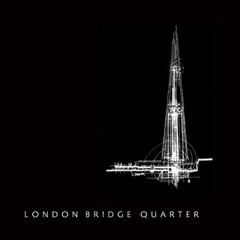
Designed by master architect Renzo Piano, the Genoese designer has to be one of the most respected of today. The glass spire, known as the Shard, will completely redefine London's skyline and the 360-metre high structure will house a unique mix of uses, making it a 24-hour living urban environment.
Renzo wanted the shape of the tower to be generous at the bottom and narrow at the top, disappearing in the air like a 16th century pinnacle or the mast of a very tall ship, and considering he is the winner of two of the industry's most prestigious accolades, I don't doubt for one minute that this will be a complete masterstroke.
Anyway, rather than me get stupidly excited about it (What? You hadn't already? -Ed), please click on the logo above.
Sunday 20th June 2010 09:29
Did next-to-nothing today, apart from tend to Tanya, catch up with my blog and with my 365 shots. I'd already decided that today's 365 shot would have to be of Tanya's feet, especially as it's as topical as it could be at the moment.
She's having to wear shoes with 15° wedged soles that are 2" thick, so not are they quite comical, they make her walk rather strange too, for they're an off-loading shoe, shifting her body weight to just the midfoot and heel, reducing forefoot pressure by as much as 57%.

The shoe design that Tanya is wearing is known as OrthoWedge ®, made by Darco, a company founded by Dr. H. Darrel Darby, DPM in 1985. He began experimenting with the idea of incorporating running shoe technology into post operation, trauma and wound car solutions into shoe design. Based in Huntington, West Virginia, the company are celebrating their 25th anniversary this year and have contributed over $500,000 to the Fund for Podiatric Medical Education (FPME), providing scholarships to podiatry students within the United States.
Unfortunately, Dr. Darby died on November 18, 2003 after a long battle with cancer and the following year he was posthumously awarded the 'Distinguished Service Citation', the highest honour bestowed by the APMA (American Podiatric Medical Association), in recognition for his contributions to his profession.
To find out more about the company, please click on their logo above.
Saturday 19th June 2010 14:37
So, having spent a night in hospital, Tanya was ready to come home. I had a fair bit of free time in the morning before picking her up so it gave me enough of an opportunity to sort out the house, making it look presentable for her return - I know it was only one night but we're talking about royalty here… the scrutiny would have been unbearable.
We ended up having a ridiculously long wait before Tanya's quota of drugs was ready, plus her second dose of painkillers were administered two and a half hours over the allotted time. To say she was pissed off was an understatement. She's having to take two types of painkiller, Co-dydramol and Tramadol Hydrochloride, as well as that, she will also have to inject herself with Warfarin (to avoid DVT) for two weeks. So, to say she's drugged up to the eyeballs may well be accurate.
Don't ask me why, no seriously, don't, but I ended up reading the two packets of pain killers (Interesting - Ed) and noticed that the Co-dydramol is actually manufactured in Bolton… of all places! M&A Pharmachem have been established in healthcare manufacturing for over 25 years and because of that, they deserve a big mention on here, especially as they aim to have an online ordering service implemented very soon.
To find out more, please click on the logo above.
So as to not leave the Tramadol out, particularly as it can be very touchy at times, I thought I'd give it a mention too. Actually, the Barnstaple-based pharmaceutical company, Actavis, has quite a cool logo, so they get my vote to blog about. They're one of the world's leaders in the development, manufacture and sale of first-class generic pharmaceuticals. They have over 350 medicines available in the United Kingdom with a further 350 or more in development.
Their website can be accessed by clicking on the logo below.

Because of the ridiculous length of time we'd had to wait, I was very concerned about what the car park fee would end up at, especially as I'd already spent around £10 yesterday. I think it's outrageous that hospitals have the audacity to charge for parking, especially as they're basically making money out of people's misfortunes. Could you imagine if a loved one was dying of cancer or some other terminal illness and you ended up having the foot an extortionate fee for parking, on top of having to cope with the fact that your loved one may never make it out again. It's absolutely pathetic.
According to national statistics, Portsmouth Hospitals NHS Trust gain a colossal amount of income per annum, £1,119,602 (in 2006), as opposed to South Hams and West Devon PCT with just short of £2000 a year. In my opinion, it's time these charges were changed to a set rate across the board, and a realistic one at that.
Anyway, one of the male nurses told me that car parking was free at weekends so I shouldn't have anything to worry about. Well at least that put my mind at rest, that was until it did come to actually leaving the car park. I drove to the barrier, inserted my card… nothing, it just spat it out. I decided to press the 'help' button and some bloke answered. I explained the situation to him, as in we'd been made to wait around for about three hours and that a nurse has said parking is free at the weekend anyway, to which the bloke said, "That isn't necessarily true, however, because you've been made to wait, I'll let you through." (Just as well he did, eh? Otherwise you'd have kicked the shit out of his television - Ed)
Since not having to pay the parking, I retained the 'card' what would have usually been stamped and swallowed at the barrier, which was when I noticed the eighties-looking logo, 'Zeag'. It turns out that they're one of the world's leading specialists in providing parking products. Their products are made in Switzerland and have been since 1952, with over 4,500 current installations from small car parks with 50 spaces right through to fully networked facilities that have over 10,000 spaces.
Please click on the logo above to find out much more about the global company.
Friday 18th June 2010 07:00
Today was hectic, to say the least. Tanya was about to undergo her second operation this year, this time on her bunions that had been a discomfort for her for a good number of years.
In the past I've heard people talk about bunions and stuff like that and nodded in an acknowledging manner, not really knowing what they were or where they were. All that has changed though, I know exactly what bunions are and where they appear. (Aren't you the clever one? - Ed)
A bunion, medically known as hallux valgus, is a structural anomaly of the bones and the joint between the foot and the hallux (or big toe as it's commonly known). It's an enlargement of bone or tissue around the joint at the base of the hallux, the joint is known as the metatarsophalangeal joint, this in turn can quite often shift the big toe in toward the second toe causing angulation of the whole toe, resulting in the whole area being swollen and tender, particularly after lengthy walks, as Tanya would testify.
Badly fitting shoes appear to point to the main cause of bunions although it's not known exactly why they occur, and even though anyone can develop one, a third more women are affected compared to men.
So there's your lesson about bunions, but before I go, I can also tell you that the word derives from the 18th century, from the Old French word, 'buignon', from buigne 'bump on the head'.
Anyway, I stayed with Tanya at Queen Alexandra Hospital in Portsmouth from 07:00 in the morning until she was called in to surgery. Luckily, she was second on the list which meant I didn't have too much of a frustrating wait. I hate hospitals so I was glad to get out, despite feeling anxious for Tanya.
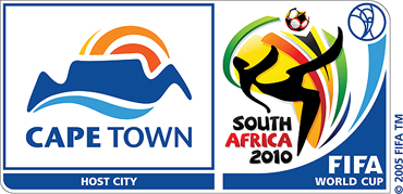
At around 13:30, Tanya called me to let me know that she was out so once I'd attended to a few errands, I drove to the hospital and spent the rest of the afternoon and a considerable part of the evening there, which was just as well, as we both wanted to watch England's second group match, this time it was against Algeria at Green Point in Cape Town (logo for the venue illustrated above). Hopes were pinned even higher on a win against the North African team so we were definitely eager to get behind our country's side.
Unfortunately, it resulted in England's second draw of the tournament, with a desperate 0-0. The team were that crap, I turned off with about 10 minutes to go, mainly due to the fact that I found myself yelling at the television and, for the second day in a row, feeling the need to kick the shit out of the television.

For those of you who are unfamiliar with hospitals these days, they're far removed from the days when you may remember visiting your grandparents in them. Queen Alexandra Hospital is something else, even though it's just a hospital. The layout and architecture of the new annex there is a bold statement and very iconic. The wards look impeccably clean and the facilities at hand are impressive. Each bed has its own angle-poise bedside service that offers television, films, games, internet access and is also a telephone. From there, you can either call one of the Hospedia team (they're the ones who provide this service) for free, or you can buy a card that slots into a card reader on the machine (similar to pay as you go) which then gives you your own personal phone number for the duration of your stay in hospital. We bought the £5 one which lasts 24 hours, there are other options available.
To find out more about Hospedia, please click on their logo above.
Thursday 17th June 2010 19:30
Despite being in the midst of the World Cup, I've avoided talking about it repeatedly, mainly because it's been quite boring, with the majority of scores being either 1-0, 1-1, 0-1 or 0-0. There are literally a handful of teams who have broken the two goal margin.
The thing that has caused the most controversy is a stupid two foot long (65cm) plastic horn called a 'vuvuzela'. They're all the rage in South Africa and seem to cause nothing but rage elsewhere in the world. The noise (it's hardly a sound) they make is akin to that of a beehive… several hundred of them, and whilst watching any one of the world cup games, there's just a constant drone in the background, making you want to kick the shit out of the television.
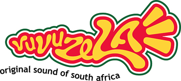
It's also known as lepatata, or the stadium horn and produces a loud, distinctive monotone B flat 3 note and is now used at most football matches in South Africa, becoming a symbol of the game, despite the fact that its loud and raucous sound emits a maximum of around 131 dBA. International commentators, players and audiences have called to ban vuvuzelas from football matches, particularly as its dangerously high sound pressure can lead to permanent hearing loss to unprotected ears after extensive exposure.
No doubt there will be a handful of English tosspots who will come back with a load and then ruin the English game. These twats should be put down. Immediately. But not before inserting at least one of the offending articles up their own arse.
Anyway, if you do fancy either becoming a twat, or more of an annoying one than you already are, please click on the logo above and buy yourself a vuvuzela.
Wednesday 16th June 2010 04:50
Managed to get myself up and out of the house for the sunrise, just before 05:00. It was a hellishly cold morning, even though the weather of late has been absolutely beautiful. Anyway, I ended up having a pleasant walk around Warblington and managed to capture my 365 image.
Later on in the day, I was wondering what I could talk about and, whilst going through my internet browser bookmarks, I realised that I still hadn't talked about some of them, one of which was probably one of the first sites to 'convert' to an online presence.
Originally known as the 'Yellow Pages', Yell.com became the UK's internet equivalent of the publication. The first pages of the Yellow Pages in the UK originally started as a single classified section in the Brighton telephone directory which was launched by the General Post Office in 1966. By 1973 the Yellow Pages directories spanned the length and breadth of the United Kingdom and by 1979 the Commercial Classified directories were rebranded as Industrial and Commercial Yellow Pages. In 2001, 'Yell' was formed and some three years later, Yell UK won the overall European Quality Award in the large business category, the only company to do so twice.

The original concept of 'Yellow Pages' started much earlier than 1966 though, it was as far back as 1883 when a printer in Cheyenne, Wyoming was working on a regular telephone directory and ran out of white paper and had to use yellow instead. By 1886, Reuben H. Donnelley created the first official yellow pages directory, inventing a multi-national industry.
And before I go, I must mention the 'walking fingers' logo. It was designed in 1962 by Henry Alexander, a well known New England freelance artist. Upon graduation from the Swain School of Design in New Bedford, Massachusetts, he began his successful career as an illustrator and commercial designer, and within a year of designing the 'walking fingers' logo, it had become the national trademark for the 'Yellow Pages'.
All that interesting information from realising I'd not talked about one of my internet browser bookmarks on my blog. (Rather impressed actually - Ed)
Let your mouse do the scrolling by clicking on the logo above to find out more.
Tuesday 15th June 2010 21:07
Today, I discovered yet another superb site full of free vector artworks… over 7000 of them (which have been downloaded more than 3 million times), if you want to nitpick. What astounded me more though, was the fact that me, a person who spends waaaaaay too long on the internet, hadn't come face-to-face with it until today.
Since 'finding' it, I've obviously been in touch with them in the hope that I could find out more… to say the response was rather rapid is an understatement. Having said that though, we are talking about designers here… ones that are proud of their achievements (And probably use a Mac - Ed).
Okay, so there's a fair bit of preamble with this one, I know, but shut up, it's worth it… so, the website in question is Vectorportal.com. It was established in 2005 by Riki Maltese, although back then it was just a hobby. As with quite a few sites that offer free vectors, they invited other people to contribute to the site and, with time, more and more established vector artists and sites started to contribute.
Their first major contributors were Vectorvault.com, Clipartandfonts.com and some American freelance designers. During this time Riki continued to design vector stuff, publishing it on Vectorportal, the main difference being that Vectorportal features at least 80% of original vectors, created by Riki and another who joined the VP team last year. The other 20% have been vectors submitted by other artists.
Although Riki did provide me with a vector-based image of the Vectorportal logo, I did prefer the one featured on the home page of the site so, once I'd identified the fonts used, I recreated it so that you can click on it and visit their fantastic site.
Monday 14th June 2010 22:52
Whilst watching Saturday's pre-match build-up to England's game against the United States, they spent quite some time revealing Fabio Capello's other interests, apart from football. To be honest, I actually found that part of the programme more interesting than the match.
Outside of the world of football, he surrounds himself with culture, some of his closest friends are either artists, literary critics or travel writers, mainly down to the fact that art and travel are two of his greatest passions.
Piero Pizzi Cannella is esteemed as being one of the most impressive artists in northern Italy and is a close friend of Capello. His other two favourite artists are the late Wassily Kandinsky, a Russian famous for his expressionism and abstract art, and Russian-French surrealist and expressionist, Marc Chagall.
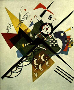
Wassily Wassilyevich Kandinsky was a Russian painter and art theorist. He was born on the 4th December 1866 and died shortly after his 78th birthday on the 13th December 1944 and is credited for painting some of the first modern abstract works.
In 1896 he settled in Munich, first studying in the private school of Anton Azbe, moving on to the Academy of Fine Arts, also in Munich. After World War I started, he moved back to Moscow, although he couldn't rationalise with the theories on art and returned to Germany in 1921 where he went on to teach at the Bauhaus school of art and architecture from 1922 until 1933 when the Nazis closed it down. From there he moved to France, where he was to spend the rest of his life, dying at Neuilly-sur-Seine in 1944.
The most famous pieces of his work include 'On White II' (1923), 'Der Blaue Reiter' (1903) and 'Composition VII' (1913), the most complex piece he ever painted.
To find out more about the artist, please click on the 'On White II' painting above.
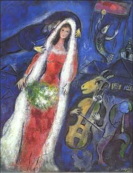
Marc Chagall was another Russian artist and was associated with several key art movements during his illustrious career. His art mediums covered a huge range such as paintings, book illustrations, stained glass, stage sets, ceramics, tapestries and fine art. Because of his huge scope of art, it made him one of the most successful artists of the twentieth century and he enjoyed universal appeal.
Born on the 7th July 1887 in Vitebsk which was once in the Russian Empire and now known as Belarus, he produced stained glass windows for the cathedrals of Reims and Metz, windows for the United Nations and the Jerusalem Windows in Israel. On the eve of World War I was when he started to produce his most vital work, regularly travelling between St. Petersburg, Paris and Berlin. During this time he began to create his own artistic interpretations based on his visions of Eastern European Jewish folk culture.
Quite early on in his life, he settled in Paris and later became known as French although he spent his wartime years in Russia where he became one of the country's most distinguished artists and a member of the modernist avant-garde, founding the Vitebsk Arts College. In the 1950s, Pablo Picasso remarked, "When Matisse dies, Chagall will be the only painter left who understands what colour really is."
Whether it was Chagall's artistic flair that kept him alive, who knows, yet he lived to an astonishing 97 years old where he died in Saint-Paul, France, on the 28th March 1985.
Please click on the 'La Mariée' (1950) painting above to find out more about the artist.
Sunday 13th June 2010 05:15
Apart from getting up early this morning and having a walk around Havant town centre in the hope of being photographically inspired, we did very little today. Once home, I took a look at my shots and had originally decided on one that I'd taken of Spring Waters, a sculpture in the Homewell area of the town centre, only I swapped it out with an image I'd taken of one of the many flowers that make up an Allium christophii (see my 365 page).
We also watched a couple of the World Cup matches and in-between times, we managed to watch a film that we'd started to watch the other night, only it finished too late, which is why we hadn't caught it all. The film, released back in 2006 is a period drama, written and directed by Neil Burger and is loosely based on Steven Millhauser's, 'Eisenheim the Illusionist'.
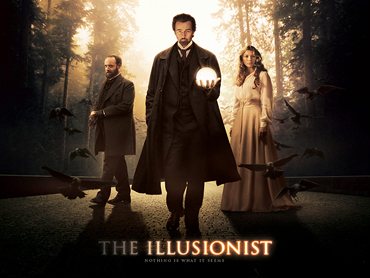
'The Illusionist' tells the story of Eisenheim, played by Edward Norton who is a magician in turn-of-the-century Vienna. He falls in love with Sophie, the Duchess von Teschen, played by the beautiful Jessica Biel, although she is expected to marry the Crown Prince, played by Rufus Sewell. In amongst the desperate romance is police corruptness and murder… yet there's a great twist to the whole tale.
Seems rather strange that this one missed our film radars and since it's such an old film, the official site no longer exists so please click on the movie poster above to watch the trailer via the IMDb website.
Saturday 12th June 2010 19:30
Some of you may be wondering something… the World Cup started yesterday and he's made no mention of it. Yes, it did start, and yes, I didn't mention it… couldn't be bothered to, to be honest.
I caught the second halves of both matches yesterday, hosts South Africa managed an impressive 1-1 draw against Mexico and France and Uruguay managed a totally boring 0-0. A fairly crap opening day, unless you're South African of course… personally, I wish they'd have kept hold of their 1-0 lead.
So, the second day of the World Cup today, with the whole of England's hopes pinned on outdoing and outplaying their closest political allies, the US of A. The pre-match hype had almost confirmed that there would be a victorious England… more about that later.
We ended up having one of our stupid o'clock wake ups, only it wasn't as stupid as last week, we were on the beach on Hayling Island for just after 05:00. The beach in question is on the far east point of the island, Sandy Point to be precise. Much of the area around there is either a nature reserve or a sailing club, nevertheless it's open to the public to enjoy, via a promenade, apart from Black Point which is restricted to members only.
To find out a little more, please click on the logo above.
From there, we then walked along Eastoke Corner and Mengham Park, home to hundreds of beach huts and a BMX/skateboarding park where we took more photographs. Eventually, at around 07:30, we headed off up to Portsdown Hill and enjoyed some breakfast whilst watching the city of Portsmouth wake up.
On to the main match of the day, England vs United States. Well, after Steven Gerrard had scored after only four minutes, I was quite looking forward to a one-sided affair, only that wasn't to be. It's not that the United States played well, they were even crappier than England… no it was all down to one man's blunder, Rob Green, the England goalkeeper.
What proved to be a ridiculously weak shot that, on any ordinary day, Green would have gathered and continued with play, the ball bounced a couple of times and, just as it appeared as if he'd blocked it, it somehow hit his hands and agonisingly crossed the line with Green desperately trying to stop it. And that's how the game finished, the shot by Clint Dempsey (what a fucking surname) making the final score 1-1, denting the immense hope England had of topping the group.
Friday 11th June 2010 17:39
Designers out there… are you frankly fucked off with receiving Windows-based files that force you go to extra lengths to open that all important document that someone has designed in Word, only to find that the 'logo' within is a fucking JPG anyway? Well now you can quicken up the arduous process (and slow down your life expectancy in the process) by uploading it to a site that will do the stressful conversion for you into a number of different formats, the most important being a PDF (portable document file).
The reason I ended up having to search is because I received a file with the suffix, PUB. What bastard use is a file like that to me? There's a huge difference between PC and Mac users, PC users assume whereas Mac users never assume. All PC users assume that Macs don't exist even though iPods and iPhones do and the ones that actually do realise Macs exist, assume that they have all the Windows programs. Wankers.
Anyway, via the website I found, you're able to upload the following documents, DOC, RTF, PPT, PPS, PUB, XLS, MHT, TXT, JPG, PNG, BMP, TIFF, WMF, EMF and GIF, so hopefully it covers the majority of shite that Microsoft provides.
BCL Technologies, who categorically state, 'We know PDF… inside and out', were founded in 1993 with headquarters in Santa Clara, California. They develop document creation, conversion and extraction solutions used to automate a wide variety of manual processes, saving time, therefore increasing productivity and profitability.
On the 'PDF Online' page, which is part of BCL Technologies, you're able to select a document or image (see above suffixes) and upload files of up to 2MB in size (by subscribing to the BCL Premium Online Service, that file size is increased to 10MB). The second step of the procedure then allows you to choose your output filename and finally, the last step asks you for your email address so that they can make sure it's valid and can receive attachments. The Premium Online Service gives you the opportunity of not using your email address, if you'd prefer to go down that route.
So, without further ado, please click on the logo above to find out more.
Thursday 10th June 2010 22:17
I noticed a logo today whose font really caught my eye and, after a bit of research, I found out what it was.
Designed by Paul Sahre and released as far back as February 12th 1995, the font 'Fur' is available in two weights, light and regular.
The font has been described with such keywords as, bulbous, irregular, distressed, edgy, futuristic and rounded. Yes, it's all of those and, what's more surprising is that until today, I'd never set eyes on it before.
What seems most strange, having furthered my research, is that it appears as if Fur is the only font Sahre has designed, although he is a very successful graphic designer, illustrator, lecturer, educator and author. Ah well, better to stop at one great font than to create several shit ones.
The 'Fur' font can either be bought as individual weights for $29 each or as the 'family' for $49 via the T.26 Digital Type Foundry which has some amazingly radical fonts to buy and a damn cool logo to boot. Please roll over the T.26 logo to preview the Fur font and click to visit the website.
Wednesday 9th June 2010 21:00
So, tonight saw the beginning of the end of an era (What the hell are you talking about? -Ed). For the past decade, Channel 4 has aired the cult show, Big Brother, the eye being one of the most iconic logos of television history.
Sadly, for some, certainly not me, it's the last ever series of the show, 13 weeks of watching some of the nation's biggest fuckwits make complete pricks of themselves and start crying like babies after three days by saying how much they're missing their families. Tell you what, don't fucking go in then if you can't hack it. Oh, and shut the fuck up about having hair straighteners taken away from you for a day… what is it with young people? They have it too easy, obviously, yet the majority of them are arrogant twats who think they're streetwise… take hair straighteners away from them and they start crying.
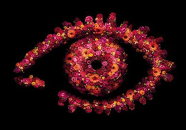
Anyway, on to the graphic design of the eye which is about the only interesting thing about the show… it comprises of hundreds of brightly coloured flowers, making a vibrant floral tribute to the end of the show and also the fact that it has always been aired during the summer months.
So there you have it, the last ever Big Brother… please click on the logo above to find out more about the final contestants and who's had an argument about a tin of tuna and other trivial shit like that.
Tuesday 8th June 2010 22:28
This afternoon I had the small, yet expensive matter of having to update the photograph on my driving licence, or possibly face a hefty fine of anything up to £1000 if I forgot. Now then, the way I see it is that our features change dramatically over the course of ten years, or even five years in my case, yet a charge of £20.00 to renew a licence is just taking the piss, in my opinion.
It's a tough enough life within having to pay and prove that you just aren't as good-looking as you once were. Oh, and that you're even more bald and wrinkly and become a bit of a fat fucker in the process. How the camera coped in Boots' photo booth, I'll never know.
Anyway, to view the said shocking photograph, please roll over the DVLA image above… to find out more about the DVLA, click on the image. I accept no responsibility for any malfunction of your computer after the event of clicking.
Monday 7th June 2010 21:19
Today, purely by accident, I stumbled upon a logo that I rather liked and, since finding out what it was, I thought that it would make for the sort of subject I like to blog about.
BAFA (not to be mistaken for BAFTA) is the British Arts and Festivals Association and covers a huge variety of arts festivals held within the UK, whether they be incredibly well-known ones such as the Edinburgh International festival, right through to events on a much smaller scale such as the Winchester Hat Fair.
Within the site, you'll find a whole section of all the up-and-coming festivals throughout the year, along with clickable links to each one, the relevant dates of the festivals and downloadable press releases, where applicable. If you'd rather not trawl through every single one, there is also the option of searching the specific festival by name or keying in exact dates, if you're looking for something within a particular date bracket.
For more information, please click on the logo above.
Oh, and before I go for the day (totally irrelevant to what I've just been talking about), the image below amused me immensely...
Sunday 6th June 2010 16:21
In late 1993, Andy Cruz and Rich Roat formed one of the largest font foundries in the business. Based in Yorklyn, Delaware, House Industries is both a font foundry and design studio. They aren't like any other foundry either, for they go to elaborate lengths promoting their fonts by creating chairs, pillows, shoes and many other items that are inspired by the fonts they sell. In one of their promotions, they created René Albert Chalet, claiming that he was the creator of their new font, Chalet.
As well as all of this, they're famous for certain typeface creations, many of which have appeared on television such as, Nickelodeon's TV Land, VH1's Best Week Ever, films such as Mission: Impossible III and also on commercial products, for example Ann Taylor garment tags, the Lucky Charms logo and Green Day's 'Dookie' album.
I could spend hours singing their praises but rather than do that, click on their logo above to find out much more.
Saturday 5th June 2010 03:00
Yes, you read the time right, that was when Tanya and I decided to get up, in the hope that we could catch a most stunning sunrise down at West Wittering in West Sussex. Surprisingly, both of us seemed more than pleasant, which was a bonus.
We were out of the house for about 03:20 and, since there was hardly a soul around, we made West Wittering in very good time. The drive there wasn't as amazing as I thought it would be, for we saw two hedgehogs and hundreds of rabbits… I was half expecting to see at least one badger… ah well.
We parked outside St Peter and St Paul Church, as it was the most accessible route down to East Head, other than wait until 06:30, in the hope that the barriers on the West Wittering Estate would be open. Although I don't hide the fact that I'm a devout atheist, St Peter and St Paul Church is a typically beautiful village church and well worth a visit.
Whether or not you could say the sunrise was stunning all depends on whether you were there or not. Looking back through the 100+ photographs I took, there are many that are very nice indeed, yet could you actually say, 'Wow! That's amazing!!'? Difficult one to call really. What I can say though is that it was incredible having the whole peninsula to ourselves… not a soul around until around 06:00am.
West Wittering Beach and the sand dunes of East Head have been awarded an AONB (Area of Natural Beauty) making the area part of the National Parks and Access to the Countryside Act which celebrated its 60th anniversary last year.
To find out more about the 49 AONBs and the 14 National Parks that are covered, please click on the logo above.
Once we'd had our fill of photography, we walked back to the car and then drove down to the car park which we were hoping would be open. Although it wasn't manned, by paying £3 at the barrier, it granted us access to the beach car park, far better than waiting that little bit later and having to pay £7 for all day parking - yes, it's a total rip-off, isn't it?!
Anyway, we then walked down on to the beach and started to cook our barbecue breakfast; bacon sandwiches and a cup of tea. Other than being completely hassled by a small contingency of dogs, one of which came bounding over, trod on our lit disposable barbecue on more than one occasion and then made off with one of our bags right down to the other end of the beach, it was fantastic just taking in the morning sun, knowing we'd been there for two and a half hours.
At around 10:30, we decided to make our way back, mainly because the beach had soon filled up with rowdy people and they ended up spoiling all our fun. We did however, stop off at Itchenor on the way back and chilled out eating an ice cream and a lolly whilst watching the world go by in Chichester Harbour.
To find out about the whole Chichester Harbour area, please click on the logo above.
Friday 4th June 2010 14:27
The rotation of stock within most supermarkets is just about acceptable, some proving to be a little better than others, so finding new ales to drink can prove to be a tricky pastime, unless you're prepared to pay that premium at the likes of Southwick Brewhouse and other real ale wholesalers.
You may remember that mid-way through May, I'd been told about a relatively new wine merchants in Petersfield that also sold real ales… well, it was time to return there and see if it was true about them rotating stock… it was, and I ended up buying five bottles of ale, all from the same brewery.
I'd already had bottles of TEA and BSA, as well as sampling the skull splitting OTT at Selborne's 'Zig Zag Fest'. all of which were superb ales from Hogs Back Brewery. The superb thing was though, was the fact that there were a handful of ales from the brewery that I hadn't sampled, as well as the fact that they're all now brewery conditioned. Don't get me wrong, cask conditioned ales are superb and despite the fact that sediment from them doesn't particularly bother me, it is pleasant to pour a cloudless ale.
So, as I said, I bought five Hogs Back Brewery ales, they were: 'OTT' Old Tongham Tasty, a 6% ABV strong dark ale (named after the village of Tongham where the brewery is), 'HOP' Garden Gold, a premium 4.6% golden ale, 'TEA' (Traditional English Ale), a full-flavoured 4.2% ABV smooth ale, 'Gardeners Tipple', a refreshing 4.0% fruity beer with a hoppy aftertaste and finally, 'Brewster's Bundle' a commemorative 7.4% strong golden ale to commemorate the birth of Hogs Back Brewery's lady brewer's baby girl.
To find out much more about the brewery, please click on the logo above. I hunted high and low for a vector artwork of the brewery logo to no avail, so I ended up redrawing it, a copy of which can be found here.
Thursday 3rd June 2010 21:00
There are a handful of property buying programmes that I like to watch, one is BBC2's 'Escape to the Country' despite its superfluous amount a incredibly annoying presenters. One that remains to keep me entertained though is 'Location, Location, Location' even though its name is pants.
The huge plus side to the show is both its presenters, Phil Spencer and the delightfully sexy Kirstie Allsopp. Until recently, I thought they were an item (No mate, they're far too happy for that - Ed) until a fairly recent episode where Phil made reference to his wife.
The 30-minute show was originally aired in May 2001 and used to feature just one couple who were looking for a house in a town and since a major revamp in 2007, the show now features two sets of buyers with different tastes who are looking for a house in the same city or town, switching back and forth to the different househunters. The show, produced by IWC Media, which is part of the RDF Media Group, now lasts 60 minutes and is shown on Channel 4.
To find out more about the show, or to watch the latest episode, please click on the programme logo above.
Wednesday 2nd June 2010 21:03
Disturbing but true… today marked my 24th anniversary of being a graphic designer. Where the fuck did all that time go? It started in 1986 on a small industrial estate on Tonge Bridge Way on the outskirts of Bolton. Some lunatic by the name of Dave Adderley employed me as his right hand man and I haven't looked back since (well, I have, although I've never regretted being a graphic designer).
Back then it was all Letraset or ordering typesetting from a bureau in Bury and using a PMT camera (Photo Mechanical Transfer) in order to adjust the size of text or graphics being used. Not only was it a much slower process twenty or more years ago, there was far less urgency, clients knew artwork could take some time. There were times when there was no other alternative but to redraw lettering using a Rotring pen, a french curve and black ink. How times have changed.
Anyway, later on today, I was more than happy just sat at my computer with the back door open, enjoying what was a lovely evening when it was spoiled by the ridiculous amount of dogs in our neighbourhood, all deciding to have a good old bark. More and more joined in to the point where I was seriously thinking about making a huge Korean meal, if you know what I mean.

I suddenly had the inspired idea of fighting fire with fire though, and, after a relatively quick Google search, I was well and truly armed, causing absolute fucking mayhem within an impressive radius of dog city. I'd found some amazing sound files, all free to download, of groups of dogs barking like bastard. It fucked them up and brought a huge smile to my face, knowing I'd won gold in the 'Bark like bastard 2010' competition. I'd began as the underdog (Such a sad sad pun - Ed) and excelled.
Searching around the site, I then ended up pissing myself repeatedly having found the Cartoon Sound FX section, the best probably being #36, 'Out Here' which just reminded me of the days when I used to watch 'Scooby Doo'.
You just have to click on the logo above to have a listen. I've directed it straight to the Cartoon Sound FX.
Tuesday 1st June 2010 20:08
Tanya had booked the day off today so she could spend it with her Mum. They had a lovely day together so it meant that I was home alone after 2:30pm, giving me reasonable time to carry on with some work I needed to do.
It gave me time to complete a very complex illustration, a considerable amount of time at that. It was of a TT2518 Topeak Mini 18 Bike Multi Tool. Basically it's a one piece super-light folding tool which houses 18 individual tools that fold into a forged alloy, anodised body.
The chain tool within is compatible with all single and multi-speed bicycle chains, including hollow pin chains (Campagnolo, Shimano, SRAM).
The whole thing comes in a nifty neoprene carry case as well.
To find out more about the various products that Topeak have on offer, please click on their logo above. Alternatively, click here to view the illustration I created in Illustrator.