Saturday 31st July 2010 11:35
Having taken a photograph of a 17-hole salt shaker for my 365 yesterday, I wasn't entirely sure what it was called at the time, and after a simple Google search, I found out that it was called a 17-hole salt shaker. Whilst on my hunt, I was alerted to a web-based article on the Daily Mail site from June 2008 that highlighted Health and Safety's concerns about the number of holes in chip shop salt shakers.
Apparently, research has suggested that implied that reducing the amount from 17 to five could decrease the amount that people sprinkle on their food by more than half. Since then, several councils have already ordered the five-hole shakers, all at taxpayers' expense, which is very nice of them to do so. I'd sooner someone spend money on telling me how much salt I should have rather than repair potholes in roads, tidying up litter-strewn streets or saving much-needed schools.
Annoyance aside, I do understand that salt is bad for you and that we should all consider cutting down somewhat. It can raise blood pressure, which in turn increases the risk of heart disease and stroke. Alarmingly, about 75% of the salt we eat is already in the foods we buy, the majority being in processed foods. The Food Standards Agency is working alongside the food industry in the hope that these levels can be drastically reduced.
To find out more about the FSA's campaign, along with many other topics related to food, please click on the logo above.
Friday 30th July 2010 17:34
Today's blog just had to be about real ale, particularly as I've recently tasted two exceptional ales, both from the same brewery. The brewery in question is Yorkshire-based Cropton Brewery, found in a small village called Copton, part of Pickering in North Yorkshire.
Beer has been brewed in Cropton since 1613, although the earlier brews were illegal; anyone breaking the law was sent to York Gaol. In 1984, the ancient craft returned to the village when Cropton Brewery was established in the cellars of the New Inn. The first ale to be launched was 'Two Pints', the success of which meant that the beer had to be produced to supply outlets further afield. Ten years later and a larger brewery had to be built at 'Woolcroft', the farmland behind the New Inn.
Within that year, the production doubled and it witnessed the introduction of their first bottle-conditioned ale.
The two ales I have sampled are 'Monkman's Slaughter' a strong bitter at 6.0% ABV, aChampion Beer of Britain, winning the Gold Medal for the Strong Beer Category in 2000. This is a full-bodied brew, a deep brown with a distinct malt flavour using the finest crushed pale, crystal and roasted malts, combining perfectly with Kent Challenger and Goldings hops.
The ale is named after Mr Monkman, who grows the malt, and Mr Slaughter, Cropton's brewer and chemist… the two chaps now have a perfect alibi though, with both feeling it necessary to sit at the end of the bar in the New Inn and checking that the finished product is worthy of having their names put to it.
The other ale, 'Old Goat' is slightly more than a strong bitter, for this one clocks in at 8.0% ABV, yet it's surprisingly smooth, considering its strength. It's a pale bitter with a strong malty flavour and is brewed with fine English hops which gives it a slight citrus taste.
Please click on the logo that I ended up redrawing due to the fact that there isn't a single download area on their entire site, despite it being well designed. To download your own PDF of it, please click here.
Thursday 29th July 2010 19:11
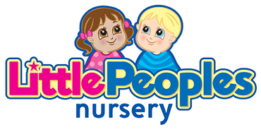
Since taking the staff photographs for the Little Peoples Nursery, Abbi, Tanya's daughter, wanted a copy of them emailing over so that they could print them out and display on the relevant walls of the nursery. The reason she needed them is because, by law, Ofsted have made it compulsory that the staff working in particular rooms need to be identified.
With each individual file being over 20MB and the fact that they were saved as .PSD (Photoshop documents), I suggested that I burned them onto a CD, as well as resize the images to a more workable .JPG size. The best program for undertaking such a job has to be Toast, created by developers, Roxio.

Roxio Toast is a media conversion software application, specifically designed for the Mac OS X operating system. The name is a play on the word 'burn', a term used for the writing of information onto a CD or DVD via the use of a laser. Although discs can be burned directly through the Mac OS X operating system, Toast provides extra features including file recovery for damaged discs, cataloging and tracking of files burned to disc. It also provides support for audio and video formats such as FLAC and Ogg.
Toast was originally developed by Dr. Markus Fest and his company 'Miles Software GmbH' which was distributed by Astarte. In 1997, the product was then purchased by Adaptec and later transferred to Roxio, a division of the company. The latest version of the program is Toast 10, the release of which was announced on January 5th 2009 at MacWorld Expo.
To find out about Roxio Toast, please click on their very cool application program icon above.
Wednesday 28th July 2010 19:29
A colleague of mine has a great interest in art, as do I. The only difference though is that he is very much in touch with the history of it, whereas I can hardly remember any of the artists that were covered during my short stay at Art College.
The reason I've brought this subject up is because he was hoping to order a print called 'Andromeda', c. 1927-28, painted by Polish Art Deco painter, Tamara de Lempicka. Born Maria Gorska on May 16th 1898 in Warsaw, Poland, she was the middle child with two siblings. She was part of a wealthy and prominent family, her father was a Polish lawyer whilst her mother was the former Malvina Decler, a Polish socialite.
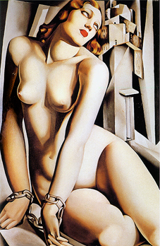
Her life wasn't the easiest in her early years, yet by the time she was 27 years old, she had her first major show in Milan, Italy, under the sponsorship of Count Emmanuele Castelbraco where she painted 28 new works in just six months. From there, she became the most fashionable portrait painter of her generation and through her distinguished network of friends, she was able to display her paintings in the most elect salons of the era.
Having had success after success, Tamara settled in Cuernavaca, Mexico to live amongst the ageing international group of aristocrats. After her only child's husband died of cancer, Kizette attended to her mother for three months until Tamara died in her sleep on March 19th 1980, aged 81.
To find out more about the illustrious painter and her life, please click on the 'Andromeda' painting above.
Tuesday 27th July 2010 20:22
Tonight I continued with designing my new design site. It will be done in CSS (cascading style sheets) and will be far more contemporary and commercial than my existing one.
During the afternoon I became inspired with an idea which seems to follow on quite nicely with my 'play on words' photography and my recently rekindled fascination with macro photography. Each section of my site will have a large banner with a monochrome macro image of something that's related to the category. Whatever that image may be, I've done some internet research about it and there will be a snippet of trivia under each one.

So, the banner I'm going to give a special preview to is the 'Home' one. As you can see I've used the link of a set of house keys because it's what we lock our homes with. It also suggests security to the client which cannot be a bad thing. Another good reason why I've chosen to go down this route is to hopefully give the potential customer a good idea of how igdesigns can 'think outside the box', as well as showing my skills as a photographer.
The bit of trivia I've decided to use with the keys is: The oldest known lock was found by archeologists in the Khorsabad palace ruins near Nineveh.
Earlier on in the day, just to reacquaint myself with what people look for with website design, I visited a very informative link provided on the Smashing Magazine website. Luckily my design doesn't look at all familiar with any of their listings but it did make me realise that people want a clean and simple design, nothing too fussy and certainly nothing too wordy.

Smashing Magazine was founded in 2006 and it provides useful and innovative information to both web designers and developers, showcasing the latest trends and techniques within the field. The website also has a very friendly online design community with thousands of talented designers who are either able to gain new insights and ideas from the site or share their experience with fellow designers.
To find out more, please click on the logo above.
Monday 26th July 2010 22:28
Two great things happened today, one was totally and utterly unexpected. Well I thought it was great anyway.
A major decision was made with regards to my designs logo… at last, I'd finally designed something that I thought was just genius, especially as the letters 'i' and 'g' are so difficult to combine, whether it be lowercase, capitals or mixed case. I'd almost given up hope and had designed a handful of logos that I was happy with, yet I just wasn't ecstatic about… this one was definitely it though!

Since designing it, I've now taken the idea a few stages further and hope to have something completed within the next few days. I'll obviously announce it here, once I have. For the moment though, the new logo, that's had comparisons made to an elephant, can be seen above. Before I finish talking about it, I just wanted to say that I have no qualms about it looking like an elephant, especially as my home town of Bolton is very much associated with the animal. The town's coat of arms features the animal, as well as the many that adorn buildings and street furniture throughout the town centre and beyond.
Next time I'm up there, I may go on an elephant hunt, especially!
Later on in the day I signed into Skype, as I usually do, so that I can catch up with my Mum and occasionally listen to my Dad's Monday night Jazz Show on Bolton FM. Tonight was that little bit different though, for my Mum had been joined by my two nieces, Jenny and Hannah, aged 12 and 8 respectively.
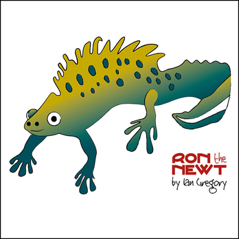
My Mum had threatened to read them my Ron the Newt stories and what better time to do it whilst I was around to receive any feedback. Since they're relatively short stories, I didn't have to wait too long for their response. I was very concerned as to how 'adult' my use of words was yet my Mum said she interpreted it into much simpler English. What I was absolutely thrilled about was the fact that they were eager to know what the big words meant whilst having a story read to them. Result.
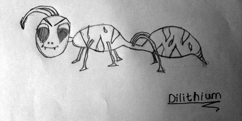
Anyway, it wasn't long before both Jenny and Hannah were merrily chatting to me on Skype, both typing excellent English and very keen to let me know how much they'd enjoyed hearing my stories. My Mum had shown them my drawing of Ron the Newt, a Hairy Burp and Colin the Pondskater and I'd explained to them how difficult I was finding it to put draw the character, Dilithium.
Jenny then said she had an idea and that she would sketch it and email it to me via her iPhone (yes, a twelve year-old with an iPhone… don't they grow up too fast these days?!) Within ten to fifteen minutes and email came through with Jenny's sketch… I was very impressed, especially as it fitted his character perfectly. The only thing I did say to Jenny was that I'd have to alter his head a little. So, Jenny's sketch can be seen above. I then drew his outline and emailed it to my Mum so that she could print it out and Jenny could colour him in accordingly, take a photo on her iPhone and email it back to me. From there I then promised I'd finish off making him as 3D as I could… both Jenny and Hannah had decided they weren't going to bed until I'd finished drawing him. Roll your mouse over Jenny's sketch to see the finished result.
I have to say that it was an absolute pleasure talking to them both and the fact that we'd both made each other's evenings. Had a brill time, I did.
Sunday 25th July 2010 15:15
Apart from spend the majority of the day trying to decide upon a suitable new logo for my designs site, we both did very little today. One thing I did learn is that asking a large audience of people for their critique of logo design isn't a particularly good idea.
In no way, shape or form am I condemning people for having an opinion, after all, it was me who asked them, it's just that you're going to receive a wide range of remarks and preferences. That's exactly what happened. Not only that, people with a design background would inevitably go with the ideas that are a little 'out there', especially if they venture into daring colour schemes or push the mind that extra inch, whereas the ones without the design backgrounds usually play it safe.
Once the website is complete, I may show the progression of the design, for I feel it would make a good subject for potential clients to see.
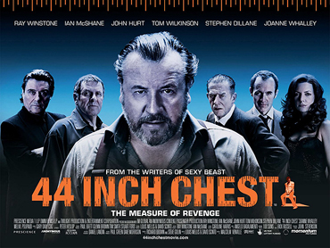
Since my brain had been challenged throughout the day, it only seemed right to take a break and what better way to do that than to sit down and watch a film? It had been quite some time since we had done that and, whilst scrolling through the plethora of films available on FilmFlex, I suggested '44 Inch Chest', a British film directed by Malcolm Venville and written by Louis Mellis and David Scinto.
It stars Ray Winstone who plays a jealous husband who, along with his friends, kidnap his wife's lover with the intention of teaching him a lesson, one way or another.
Other big name stars include Ian McShane and John Hurt and it was also great to see a cameo performance by the gorgeous Joanne Whalley who's still as gorgeous as ever.
Anyway, I won't talk about it any more apart to warn you about the use of extreme language. The word 'fuck' is used 162 times and the 'cunt' tally must be near on 50, easily. Brilliant dialogue throughout, even if you ignore the swearing.
To find out more, please click on the movie poster above.
Saturday 24th July 2010 13:42
It was a very sad day in the world of sport today, Alex 'Hurricane' Higgins sadly passed away after a twelve-year battle with throat cancer. Born on the 18th March 1949, the snooker player from Belfast was World Champion on two occasions, the first in 1972 and again, ten years later in 1982.
A true legend of the game, despite his unpredictable character, for he was one of the most charismatic players ever.
During the afternoon, I finally decided that I needed to convert my sketches of Colin the Pondskater (from my Ron the Newt stories) into an actual 'life-like' artwork, bearing in mind that I'd already stated he was a cross-dresser and had a pink glittery boob tube… so here he is.

Managed to get out of the house mid-afternoon and take a trip to Southwick Brewhouse for another well-earned batch of real ales; they were as follows: 'Kernow Gold', a light refreshing 3.7% ABV amber beer by Lizard Ales, 'Golden Lance', a 4.0% ABV gold and fruity ale by the Keltek Brewery, 'Magik', a citrus and malty ale at 4.0% ABV by the Keltek Brewery, 'Bronze' a full-bodied 4.5% ABV beer from The Celt Experience, 'Rowley Mild' a rich and flavoursome 3.2% ABV ale by Wensleydale Brewery, 'Beast' a strong 6.6% ABV ale brewed by Exmoor Ales, 'Guzzale' a premium bitter, 4.6% ABV by Plymouth-based Summerskills and finally, 'Monkman's Slaughter' a powerful 6.0% ABV brew by Cropton Brewery.
Yes, the trip was well worth it...
Friday 23rd July 2010 09:46
Even after twelve years of using the internet, I'm often amazed at just how many sites are out there, many of which I've never seen before, making me wonder how I ever missed them.
For the life of me, I cannot remember how I found the site that features in today's blog, although I suspect it was whilst I was either hunting for a specific font, graphic or image.
Unusually, the site is an Argentinian one, a country that you wouldn't automatically associate with fonts, graphics or images. Not for one minute am I stating that they're a country who don't have such things, it's just unusual, especially as you take the United States and the United Kingdom into consideration.

Anyway, I'm rambling. So, today's blog is about an Argentinian website called 'Blue Vertigo'. Now I was rather hoping I could find out a little more about the website but their 'About' page goes nowhere so I'm left with explaining it myself.
It's like the best search engine you'll ever find that encapsulates all the very best websites that concentrate on media and design, not only that, it's split into categories and those categories have subcategories, for instance, 'Stock Photos' has comprehensive listings for 'Stock Photo/Free', 'Stock Photo/Free/Textures', 'Stock Photo/Cheap', 'Stock Photo/Commercial', 'Stock Photo/Commercial/Specialised', 'Stock Footage (Video)' and that's just one section!
Other sections include 'Vector Clip Art', 'Fonts', 'Logotypes', 'Photoshop Brushes', 'Poser Downloads', 'Icons', 'Sounds' and 'Mix'. Having visited this site, you probably won't want to choose any other resource for media-based information and files.
Please click on the logo to be dumbfounded...
Thursday 22nd July 2010 09:05
A colleague of mine lent me a book called 'e Blunders' which was very funny indeed and then a few of us got into a discussion about 'The Book of Heroic Failures' whereby the author was thrown out of the society having been successful with it.
From that conversation, we then started to discuss the Darwin Awards, of which one of my colleagues had never heard about. So, for those of you who don't know, what is a Darwin Award? Well, firstly the award is named after none other than the Father of Evolution, Charles Darwin and the awards are given to commemorate those who improve our gene pool by accidentally removing themselves from it, often in a truly bizarre manner. Some survive to tell their tales of idiocy.

Lawn Chair Larry has to be one of the most famous survivors having attached 45 helium-filled weather balloons to his lawnchair, named 'Inspiration I'. Each balloon contained 33 cubic feet of helium and no sooner had his friends cut the chord that anchored him down, he rose above the city of Los Angeles as if he was rocket powered… he was hoping to float about 30 feet above his backyard yet it wasn't until he levelled out at 16,000 feet that he realised he'd made a huge mistake.
To read the whole story and to find out about other imbeciles that have walked this Earth, please click on the logo above.
Wednesday 21st July 2010 16:15
Today's blog involves a very embarrassing, yet piss funny, true story…
At 12:46 today, an email was sent to me, entitled 'as promised' and contained nothing more than the graphic below.
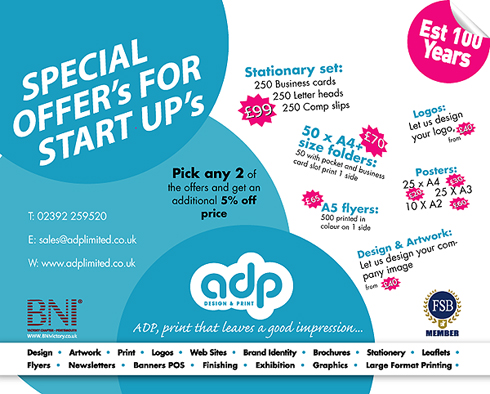
Now then, I can be a right twat at times, as you all know, and once I'd received it, I saw red… big time.
I responded with the following…
Dear ADP Design & Print,
This is the sort of email that really annoys me... WHY?
Well, the message title was 'As promised'... What? As promised, this email will really annoy you?
I've never spoken to you, so why would it be, 'as promised'?!
Even if I HAD spoken to you, I wouldn't have passed on my details to you.
Nevertheless, I viewed your email and my eyes were automatically drawn to the two ridiculous apostrophe S's, top left.
My eyes were then drawn to 'Stationary set'... well, I should hope it DOESN'T move, otherwise I'd be slightly worried.
Every other plural on the page doesn't possess an apostrophe S... at least be consistent with your inaccuracies!
Finally, the strapline humoured me immensely... 'ADP, print that leaves a good impression...'
Not here it doesn't... I'd steer well clear of any company that are clearly unable produce basic grammar and punctuation.
Please refrain from emailing me any further literature, unless of course you would like further ridicule.
So so regards,
Ian Gregory
Later that evening, I had received a reply, which read…
Hello Ian,
Sorry that the email sent to you caused so much distress. It was no the intention.
Dean from Dot Inprint works with us now and said it may be an idea to send out a mailer
to his old clients. Hence you receiving the email. Clearly the subject matter should have been more clear and perhaps a sentence or two explaining the reason for sending this to you, plus a spell check would not have gone a miss!
Though feedback is appreciated it did feel a little strong. Also you say ‘clearly unable produce basic grammar and punctuation.’ I believe you missed the ‘to’ out between unable and produce. so clearly we are all open to making mistakes.
However I can assure you we will remove your email address from the list so you do not receive anymore unwanted emails.
Sorry for any inconvenience caused.
Many Thanks
Glenn
ADP Limited
Unit 37
Aston Road
Hampshire PO7 7XF
T: 023 9225 9520
F: 023 9225 9521
www.adplimited.co.uk
For those of you who don't know, whenever we've had printing done, Dean at Dot Inprint was our principal contact. He's an absolutely great guy and, having read their reply, I felt an absolute tosspot and had to reply with the following…
Hi Glenn,
Yes, my email was very strong and now I owe you (and Dean) a huge apology.
I'm sure Dean will absolutely laugh his head off when he reads this email!!
Had I known that he was involved with you I wouldn't have ever sent such a strong email and feel somewhat embarrassed for my outburst! I receive so much junk that I occasionally vent my anger against some of it!
Dean is a great guy and I have an awful lot of time for him. In some respects I wish that you had introduced yourself a little better... and thanks for pointing out my mistake!
Despite my outburst, I am actually looking to have some business cards printed, and, in way of an apology, I'd like you to quote for them.
As yet, my whole redesign is in its infancy so once I've completed it, I'll send over my specifications.
One way of generating business... annoy me and end up with an order!
Best regards,
A very embarrassed Ian!
Moral of the story? Sometimes it pays to not be a pompous fucking wanker. Please click on their graphic above to find out more about them - WARNING: website automatically resizes your web browser window.
Tuesday 20th July 2010 20:23
Since writing my first short story about Ron the Newt, I've now completed a further three 'chapters', introduced other characters and the whole scene has developed remarkably well, even though I say myself. A small but devoted fan base seems to have formed and I now feel as if I'm in a position to think about trying to publish some of these stories.
The other three chapters, in chronological order are, 'Ron the Newt gives Imaginary Platinum Award', 'Ron the Newt and The Annual Carnival' and the latest installment, 'Ron the Newt and The Hairy Burps'.

An excerpt of the latest story reads:
For those of you who don't know, the Hairy Burp is very contagious and, once it has left the body of the victim, the burp changes into a solid mass with tentacle-like feelers that latch on to the weeds at the very bottom of the pond. Here they cause utter disruption, usually being swallowed by the larger inhabitants of the pond, creating their own homes within the guts of their casualties.
Having 'published' it to my fan base, I'd been asked to illustrate what a Hairy Burp would look like… I've included an image above.
Monday 19th July 2010 15:47
Whilst on the hunt for some cool wedding vectors (I'd been asked to design an Order of Service for a wedding that's taking place this weekend), I was directed to a site that I've visited on a fairly frequent basis, just never included it on my blog… that was until now.
Back at the beginning of 2007, Shawn Rubel had just launched 'Brusheezy', which became one of the biggest selection of Photoshop Brushes that was currently available on the internet. During that time, he was also receiving requests from fellow designers who were eager to upload and share the vector art they were producing… and that's how Vecteezy was born.

Now then, you may think that 'Vecteezy' is a stupid name, well, you're okay to think that because they think that too. What's it matter though? A stupid name is bound to attract attention, so it's great marketing. The great thing is though, is that it's just brimming with cool vector art, the majority of which has been uploaded by its members and is free to use (some may need a licence, please check).
Although the site is relatively new in internet terms, it's just been relaunched with a redesign earlier this year. There are about 35 pages of active uploaded vectors and brushes, including many more resources on the site as well.
Please click on their logo above to find out much more.
Sunday 18th July 2010 22:37
A great find for all you Mac users, especially if you can recall some of the great system sounds from days gone by. Whilst there are some pretty good sounds that come with Snow Leopard, there are many that seemed to have been forgotten about and these are the ones that were brilliant…
'Wild Eep' has to be one of my favourites although there were others such as 'Monkey', 'Boing', 'Whit' and 'Quack' that were equally as funny. I haven't a clue as to how or why I decided to have a hunt around for these old sounds, nevertheless, I found them relatively easily.

Anyway, before I provide the link to download these sounds, I can tell you that MacUpdate is the 114th fastest growing privately owned company in the United States, according to Inc. Magazine and has featured in the former magazine as well as the NY Times, USA Today and Macworld Magazine to name a few. Basically the website helps owners with Apple products to find and update their software, offering membership to make it even easier for the user to stay connected to the latest and greatest tools to help with efficiency.
The site receives over 5, 300, 000 unique visitors and 9, 200, 000 visits per month and has sold over 1.5 million copies of software on MacUpdate Promo in the last three years. The website just happens to be the 2nd most popular software website on the internet, second to Apple.
So, without further ado, please click on the MacUpdate logo above, to find out more about the website and to download the brilliant system sounds.
Saturday 17th July 2010 05:45
At the moment it's not much fun for either of us whilst Tanya is debilitated. It seems months ago since we enjoyed a long walk somewhere, and as much as Tanya has noticed a loss in definition with her leg muscles, I feel somewhat the same. Luckily though, as I'm a particularly early riser during the summer months, as well as the fact that the 365 Project is forcing me to get out and about, I have the option of venturing out whilst Tanya is still in the land of nod.
I headed for Pagham Harbour again, especially as there were some shots that I'd taken whilst there last week but decided on my Chichester Skyline shot for my 365, superseding all other shots I'd taken that morning… seems a shame sometimes that it's just one a day. The only trouble was, once there, I realised that the tide was in, spoiling any chance of taking the shot I wanted. Ah well, there's still a long way to go with the project so I'm not overly concerned.

The rest of the day was spent catching up on my blog and suddenly being incredibly inspired with a new logo design for my design site. I have to admit that Tanya has been on my case for some months now, badgering me about the fact that it looks so dated and is probably turning people away. So, with my commercial head on, I started sketching and came up with what I would class as a very exciting and contemporary logo, as well as some radically different icons to go with the whole theme.
For the moment though, I shall just share the new logo and it links back to the old site until Tanya and I have completed the new one… watch this space!
Friday 16th July 2010 12:55
For today's blog, I thought I'd talk about something very much prior to the event. So, what is it then? Well, it's called 'Vintage at Goodwood', the very first of its kind to be staged there and is on over the 13-15th August 2010. It's the first of what will be an annual music and fashion led celebration of creative British cool from the 40s, 50s, 60s, 70s & 80s, featuring the leading DJs, bands, collectors, purveyors of vintage clothing and vintage vinyl from each decade, as well as contemporary bands and brands inspired by Britain’s rich creative and cultural heritage.
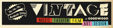
Vintage will explore the musical, design and cultural lineages and explore where they are taking us. It's already been labelled as the new annual Festival of Britain. You may have a passion for a whole host of musical diversity, such as Swing, Rockabilly, Mod, Soul, Funk, Disco, Ska, Electro, or then again Film, fashion or Art and Design may rock your boat, then again, you may just want to dress up and enjoy the atmosphere of the event.
At £55 a ticket just for one day's worth of the three-day event seems hellishly steep and will obviously attract those who have money to burn. If you are one of those people who does have an inexhaustible money pot, please click on the logo above to find out more.
Thursday 15th July 2010 22:11
After spending approximately two weeks designing and building the Little Peoples Nursery website, it was all but complete, apart from a couple of tweaks here and there. Tanya and I are absolutely over the moon with it, as is Sharon, the nursery owner.

Yesterday, I went there and took photographs of the staff, as well as a couple of other shots that I needed to continue the intimate theme throughout. When I say intimate, it's because I came up with the idea of pinpointing several toys throughout the three rooms and then creating colourful vector artworks of them (not that they needed any colour adding mind).
I have thoroughly enjoyed designing this site and very much hope that it generates interest from further afield, especially as the majority of nursery websites are particularly substandard.
Anyway, I've included images of the graphics I've drawn that have been included on the pages throughout the website. I'll like them accordingly, once the site goes live.
Wednesday 14th July 2010 11:12
Health and Safety. I reckon that more than half of their regulations are a load of cock. The remainder are probably common sense. I think the most ridiculous of late were when children were banned from playing conkers unless they wore goggles and that flying paper aeroplanes have been deemed too dangerous by the fuckwits at the Health and Safety Commission.
Don't get me wrong, I'm not saying that the HSE are full of fuckwits, far from it, although I do question whether they have too much time on their hands. Nor am I questioning the safety of children, just more a case of where do you stop when it comes to keeping anyone safe? Will there come a time when no-one is allowed to cross a road unless they're wearing a fluorescent vest, with at least six other people who are also wearing fluorescent vests and it's between the hours of 19:00 - 21:00 but only BST?

The reason for my rant is because of the somewhat ludicrous law of not wearing headphones for an iPod or mp3 player at work. Now then, it's inevitable that people operate machinery that is deemed too loud to be exposed to the actual sound of that particular piece of machinery, whether it be a pneumatic drill or other device that emits a certain degree of sound that is potentially dangerous to the naked ear.
With noises such as these, it's essential that some form of ear protection is worn, I fully understand the implications if nothing is worn to protect yourself from such levels of noise. Ear defenders are a relatively good idea, for although it's considered unsafe to block out all noise, they do protect the ear drum from the most harmful of it… but surely the earphones from an iPod or mp3 player do the same? I'm not asking that the level of output poses a risk, merely blocks out some of the monotonous sound of industrial machinery, yet allows the operator to at least appreciate something worthwhile to listen to rather than have to put up with the slightly muted sound of what could be described as the most tedious thing anyone has to endure.
Health and Safety categorically state that someone wearing earphones from an iPod or mp3 player is more likely to miss life-threatening hazards, such as fire alarms or the possibility of them being unaware that someone is nearby or even behind them. Surely ear defenders would cause the same potential hazards? Sorry, I haven't bought your idea, I just think you're a set of miserable fuckers wanting to make everyone else as miserable.
If you'd like to find out the latest load of shite that the Health and Safety Executive are willing to put forward, please click on their logo above. Alternatively, you can enjoy life to the full and ignore the repetitive bollocks they continually spill out.
Tuesday 13th July 2010 09:46
Here's something bright and colourful for today… the Crawley Borough Council logo. Now then, I actually quite like it, yet some anti-Tories think differently.
Even though it's now some three years since it was designed, there have been online discussions as to the fact that it's based very much on the old and new Conservatives logos. Compared with many new corporate rebrandings, the £12,000 it cost may seem slightly trivial yet it now possesses some fifteen colours as opposed to the previous three.
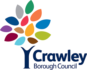
Anyway, the number and colour of leaves represents the number of neighbourhoods within Crawley, all of which are colour-coded. As good as an idea that is, what if a new neighbourhood springs up with the borough… what then? As someone quite rightly pointed out on the internet, it would be as embarrassing as when the early American flag kept having to be redesigned as and when more states joined or the 50p pieces that depicted the EU countries with a ring of hands… some 13 years later it all changed when Greece joined.
I cannot ever remember visiting Crawley, nevertheless I do like the logo so I'm providing a link to the council's website.
Monday 12th July 2010 22:47
At one time, today's blog would have only had relevance to Mac users, but since web browser Safari became available to PC users as well, it's equally as exciting for them. Not only that, it's of ultimate importance and excitement for my growing number of blog fans… and I'll tell you why. I discovered something quite incredible today, whilst using the latest version...
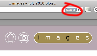
Since Safari has been the first web browser to integrate HTML5 into its workings, it means that there are over a dozen new features that allow developers to create interactive content and media experiences that work within the browser, avoiding the need for third-party plug-ins. As well as those, it also has a Bing search engine option on top of the usual Google search but for me, the best and most useful addition is the Safari Reader.
I have highlighted where you would see the 'Reader' which is in the smart address field on the extreme right of your address bar or, if you want to get technical, the Universal Resource Locator.

So what does the 'Reader' do? Well, it allows readers such as yourselves to view my blog in large print by opening up a separate window which pops up and greys out all other webpages, and displays the page in a clutter-free view. The new 'page' also has other onscreen controls that allow you to email the article, print it or enlarge the text to quite a colossal size. Remarkable stuff.
If you haven't already, I suggest you download the latest version of Safari by clicking on its logo above.
Sunday 11th July 2010 19:30
So, from the opening match on the 11th June, the World Cup Final was upon us. It seems absolutely ridiculous that the 1-1 draw between South Africa and Mexico was that long ago, for it literally seems like five minutes. Tonight's match was played at the mightily impressive Soccer City in the South African capital, Johannesburg.
The two teams to make the final were the Netherlands (or Holland if you prefer to call them that) versus Spain. Holland had previously made the Final on two other occasions, meeting West Germany in 1974 and Argentina in 1978, losing 2-1 on both occasions. Maybe it would be time for them to make it third time lucky? Spain, on the other hand, had never made a quarter final before, let alone a final. How apt would it be for the European Champions to claim first place in the World as well as in Europe, especially as Nadal had won Wimbledon for the second time.

I have to say that the first half was a bit of a nonentity, although Spain did start the brighter. The whole match was actually marred by disgustingly bad challenges from the Dutch team and English referee Howard Webb should have made at least two sending offs throughout the first 90 minutes. Even during half time, the BBC pundits, Gary Lineker, Alan Hansen, Alan Shearer and Lee Dixon were all absolutely fizzing about how dirty play had seemed to dominate the Dutch team's 'tactics'.
Somewhat unpredictably, the teams ended the normal run of play at 0-0, with Arjen Robben coming the closest to sealing the match in the 82nd minute.
Deservedly, Holland defender John Heitinga did receive a second caution in the 109th minute, resulting in him being sent off. It wasn't until the 116th minute, four minutes from the possibility of the dreaded penalty shoot-out, the Spanish substitute Cesc Fábregas fed the ball through to Andrés Iniesta who scored a superlative goal and gave Holland their just desserts, having mauled their opposition throughout the entire match, giving the European side a thoroughly justified 0-1 win.
To watch the highlights of the Final, please click on the FIFA logo above.
Saturday 10th July 2010 04:57
Started the day very early, although once in my car, I hadn't a clue where I was heading. I did toy with the idea of going to Bosham, yet as I continued to drive, I then thought about the city centre of Chichester. As I approached it, I decided to head down towards Dell Quay, mainly because I didn't particularly fancy strolling around Chichester on my own at that time of morning. I don't for one minute think the centre poses any sort of threat, it was more the fact that the coastline began to appeal.

On my way down to Dell Quay, I spotted the shot that was to become my 365 of the day but continued to drive around Selsey Peninsula in the hope that something more awesome may well appear. In the end, I parked up at Pagham Harbour, a 1500 acre Nature Reserve which is made up of saltmarsh, tidal mudflats with shingle, open water, reed swamp and wet permanent grassland habitats.
The area is beautifully diverse and is home to many types of flora and fauna. The shingle areas on the sea front have wildflowers such as the rare Yellow Horned Poppy, whilst the reserve has many bird-watching opportunities all year round and is important for waders and wildfowl including Brent Geese, Wheatears, Sandwich Terns, Sand Martins and Chiffchaffs.
For more information about this incredibly interesting part of the West Sussex coastline, please click on the logo above.
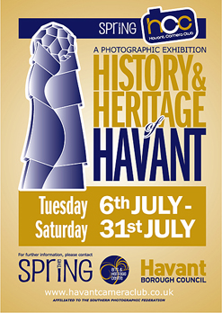
Later on in the morning, Tanya and I went to view the Havant Camera Club exhibition at The Spring Arts Centre in Havant. We'd both had every intention of submitting some work, yet time somehow got the better of us. Ah well, maybe next time.
It's an exhibition worth visiting, if you're in or around the area; with some very interesting shots of old Havant, including a shot of Leigh Park House which was once situated in the grounds of the present-day Staunton Country Park.
The exhibition runs from Tuesday 6th - Saturday 31st July - please click on the poster I designed to find out more about the club and where it meets.
Friday 9th July 2010 17:49
Since purchasing several ales last Saturday, I've sampled a good few of them, a particular favourite being 'Battle Axe' by Yorkshire-based Rudgate Brewery. Established in 1992, the brewery has many different ales on offer, although their website doesn't really make it clear what they are.
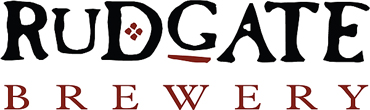
They did manage to bag Champion Beer of Britain for 2009 with 'Ruby Mild' though, and new fermenters have meant that more of the same beer can be produced each week. Anyway, I digress… back to the beer I was talking about.
'Battle Axe' is a 4.8% ABV best bitter, chestnut brown in colour with a fruity aroma, reminiscent of berries with slight woody undertones. The award winning premium bitter is brewed using a robust blend of pale, crystal and chocolate malts.
To find out more about this excellent ale and Rudgate Brewery, please click on the logo above.
Thursday 8th July 2010 11:21
I received a file today that had the suffix .dwg. Adobe Illustrator was able to open it, yet it just looked a complete mess, once open, layers upon layers of text with little else to look at. As much as I hate the fact that there are so many application programs out there, each with a multitude of ways of saving files, I also love the challenge of finding out what they are and implementing the best program with which to open it.

eDrawings is the first free publishing and viewing software that makes sharing product design data substantially easier, especially across multiple CAD environments. You are able to choose from any one of four categories, one of which will meet your specific needs.
Most users will only need to download one of the following products, either eDrawings Viewer, eDrawings Publisher, e Drawings Professional or eDrawings API (Application Programming Interface). All of these programs have been developed by 'SolidWorks', whose headquarters are based in Massachusetts. Founded in 1993, the company serves industrial, medical, scientific, consumer, educational, technology and transportation markets.
Please click on the eDrawings logo above to download your free copy of the program and to also find out what else they have to offer.
Wednesday 7th July 2010 22:46
Since creating the character 'Ron the Newt', I'd already been given a further six words in which to continue what could well become a household name, I kid you not. Tanya was absolutely shattered and that gave me the impetus to see if I could write the second short story using the new words.
My pond knowledge is slightly sketchy, luckily though, they fascinated me enough as a child so I knew of the many different weird and wonderful animals that lurk in, on and around a pond.
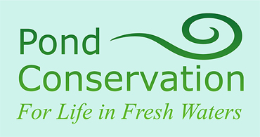
After a relatively short hunt, I found a great website, courtesy of a Google search.
Pond Conservation carry out a wide range of work to create, conserve, protect and promote ponds. Such projects include the Million Ponds Project where they want to undertake the ambitious project of digging about half a million new ponds, all high quality that have clean water, obviously benefiting biodiversity.
They are also involved with the Pond Habitat Action Plan where, along with the Environment Agency, they help protect ponds in the UK.
To find out much more, please click on the logo above.
Tuesday 6th July 2010 15:47
I asked some of the members on a forum I visit to come up with random words, and from those words I said I'd write a short story for Tanya to relieve the boredom she's facing whilst at home, recovering from her bunion operation.
The six words were: neutron, bamboozled, wibble, dilithium, smarties and crayons.
Ron the Newt by Ian Gregory
This is a story about a newt called Ron.
Ron was an amiable newt with many friends and was known for his sense of humour, especially after a few drinks (apparently this is where the common phrase comes from about newts drinking a lot). All his mates called him 'Neutron' and despite the fact that it was such an old joke, he made sure that whenever anyone thought they were the first to crack the joke, he always joined in with the laughter; in fact, he often bamboozled newcomers into thinking they'd just parted with the funniest joke ever. It was Ron's way of using a joke within a joke.
Most of the time Ron's life had been stable, as had the pond where he lived. He'd tied the knot with his lovely wife many newt years ago and had enjoyed the Great Crested way of life, never once looking down on the Common that shared the same waters.
Unfortunately, there was a mischievous and unpredictable diatomic molecule, by the name of Dilithium, who had the ability to shift and fill space within the pond. Other than cause major inconvenience with the mud routes that spanned the floor of the pond, life carried on as per usual. As well as disrupt these routes, it could split the pond by converting parts of the pond into two parts, known as Wibble and Wobble.
Luckily, Ron was all too familiar with the infrastructure of the pond as a whole as well as when it was in its Wibble and Wobble state, especially as he'd spent his early working years planning out each route by colour-coding them with Smarties.
One of Ron's closest friends just happened to be a wayward Crayfish that suffered with amnesia and insomnia. Even though he should have only been able to survive in seawater, for some reason he'd found his way into freshwater yet spent most of his time trying to remember why he could never sleep rather than needing to find his way back to the sea. One thing the Crayfish could remember though was his name, for it was Ron as well.
Years later, Ron the Newt became managing director of the pond's largest company that produced wax crayons. The crayon factory was opened after the historic second upheaval that Dilithium had formulated. The mud routes were so disrupted that it was almost impossible for any of the life within the pond to find their homes, let alone the local newtagents for their daily needs. The colours from the Smarties had all but disappeared so a state-of-the-art crayon factory was built so that the network of roads could be marked out using various colours.
Ron the Newt decided that he'd give Ron the Crayfish the best chance in life by making him a director of the Crayon Factory as well, and to this day his best mate also enjoyed jokes being made about him… he became affectionately known as Cray Ron, and, unlike Neutron, he actually thought that the joke was new every time he heard it. Bless him.
Monday 5th July 2010 22:43
Finally managed to find some time to look through the 96 shots I took of the Little People's Nursery on Saturday. Although very small, here is the shortlist of my favourite fifteen images I took… I shall hopefully put the links into place once the gallery is up-and-running.


Sunday 4th July 2010 22:38
Today's blog is going to focus on a brewery, a silly brewery at that.
Silly, to the English, means having or showing a lack of common sense, absurd or foolish. However, Silly to the Belgians is all about a village that lies within the Ath, Enghien and Soignies triangle, home to a brewery that was founded in 1850, although back then, it was known as Cense de la Tour.
In the last century, the province of Hainaut had many large farms that all brewed from barley and hops and by 1947, Brasserie de Silly (translated as The Brewery of Silly) actually became more prominent than the farm itself and some three years later, the brewery owned a chain of bars and began producing exceptional fermentation beer such as Grisette, Saison and Scotch.
By 1990, the brewery had developed such beers as 'Blanche Titje' a white beer and were also noted for 'Saison de Silly', 'Double Enghien' and 'Divine', all of which helped further the growth of the independent and traditional family-ran business.
Over more recent years, the brewery has been developing other beers with the full intention of promoting its export business.
For more information, please click on the logo above.
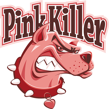
The main reason I've chosen to talk about this brewery today is because I bought a beer called 'Pink Killer' that's brewed by them. More often than not, either a beer label design or the name of a beer helps decide whether I'm going to buy it or not. In this case, both appealed to me so much, I made the decision immediately.
As far as names and designs go, you cannot get much better than this… the fact that it's a pink label may well swing it for the ladies too.
Despite the fact that I find grapefruits disgusting, grapefruit-flavoured ale is fantastic, it's almost as if the fruit exists to be used in the brewing process. One downside to the bottled ale is the fact that it's only 250ml as opposed to most other bottles that are twice the amount, more often than not - don't let that deter you though because it is a modest 5% ABV and it's an absolutely fantastic ale. It's that good, it's actually very similar to a rosé, beautifully sweet, yet not too sweet and has a kick like a mule. Definitely one of my favourite unusual ales for a long time, excellent.
Click on the amazingly cool 'Pink Killer' logo to find out more.
Saturday 3rd July 2010 14:47
Tanya's daughter, Abbi, has recently started working in a completely new nursery in an area of Portsmouth called Drayton. Her boss, Sharon, has transformed the whole of the first floor of their house into a children's nursery… yes, the house is rather big.
It's absolutely fantastic and attention to detail has been at the forefront of her mind. Luckily, Tanya and I have been given the opportunity to design their website and, within the cost, we also offered to take photographs of the various rooms and the outdoor areas. With Tanya still being somewhat immobile, I chose to go and take photographs this afternoon.
I ended up spending over an hour there, finding new angles of the rooms each time I walked around. I took the obvious shots of the rooms as a whole but then found myself focusing on toys, footballs and many colourful objects so that I ended up with a portfolio of images that portrayed fun but stylish.
Unfortunately, we weren't in the loop at the time Sharon first started her business, so were unable to design the logo, but once the website is up-and-running, I shall provide a link - I may also make a featured gallery on my website.
On the way home, I decided it was time to head straight back to Earth by calling in at Southwick Brewhouse to buy a few new beers, particularly as Al had said there were some new ones due in. Sure enough, there were a good few on offer and, after half an hour or so, I'd decided on eight (plus there was a bottle of 'Red Cuillin' by the Isle of Skye Brewery which is an exceptional ale, so I had to buy another one of those).
The eight new ones were; 'Fistral' by Atlantic Brewery, 'Pink Killer' by Brasserie de Silly, 'Kiss' by Harveys, 'Prize Old Ale 2007' by George Gale & Co Ltd, 'Ivanhoe' by Ridgeway Brewing, 'Mary Jane' by The Ilkley Brewery Co, 'Battle Axe' by Rudgate Brewery and finally, 'Old Goat' by Cropton Brewery.
Hopefully reviews of some will follow...
Friday 2nd July 2010 04:41
More and more people seem to be calling me mad these days. It may have something to do with my immense passion for my 365 project… especially as this morning I woke up at around 04:39 and was out of the house approximately two minutes later. Why? Well, if you give me chance, I'll tell you.
During the week, BBC's 'South Today' featured a news item where there was a huge horse's head which in on a plinth and stands 30ft high on a hill known as 'The Trundle' that overlooks Goodwood Racecourse. And that was the reason for me getting up at yet another ungodly hour. Luckily, Goodwood is about twenty minutes drive away from where we live, so it's not too much out of the way, especially at that time of the morning.
Once there, it took another ten minutes or so to climb the hill. It's not too high, nor too steep, although tackling it at that time of day without any food or drink inside you is quite a challenge. I was slightly miffed because as I was driving past Racton Ruin, the sky was absolutely incredible, nevertheless, by the time I'd made it to the top of St. Roche's Hill (as it's also known), I was lucky enough to witness the sunrise, and boy, was it worth it!
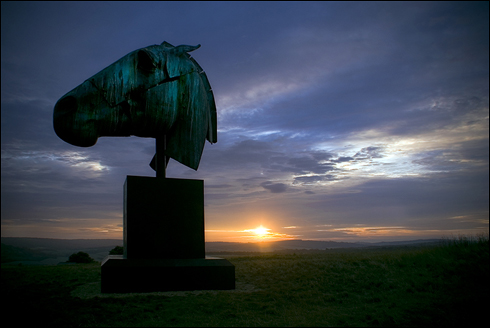
So, what is this huge horse's head then? Well, I've already determined that it's a bronze sculpture and it's by Nic Fiddian-Green. Artemis' was his inspiration taken from the Parthenon's Selene Horse and, in actual fact, 47 year-old Nic Fiddian-Green has been obsessed with the single piece of ancient sculpture since being a student at the Chelsea School of Art back in the 80s. The giant horse's head is 14ft high and spans 18ft from mane to nostril and is well worth seeing… that's if you can find your way to Goodwood before the end of July.
Anyway, to find out more about the sculptor, please click on the image I took of the monumental sculpture above.
Thursday 1st July 2010 22:03
What have pistachio nuts and recycling have in common? Well, they just both happen to be the link to the website I'm going to talk about today.
In 2006, after site owners Louisa Parry and John Leach had gorged themselves on a packet of pistachios, they sat there wondering what they could possibly do with the shells. When they then realised that they were left in the same position, whether it be leftover food, old household items, empty containers of all shapes and sizes, they decided it was high time to create their own website.
Their aim is to feature a new idea every Monday, Wednesday and Friday, making and taking suggestions as they go along.
Four years on and they've already covered almost 800 items and had over 10,000 suggestions of ways to reuse, repurpose or recycle things that otherwise have found their way into the bin. The site has been that successful that they have already enjoyed coverage in UK magazines and newspapers such as The Times, The Telegraph and the Guardian, as well as being featured on international green and craft websites including TreeHugger, ApartmentTheory and Craftzine (That's nothing compared with being on this 'ere blog - Ed)
To find out more about how you could recycle, please click on the Sketchy logo above (I say Sketchy because that's what font they've used).